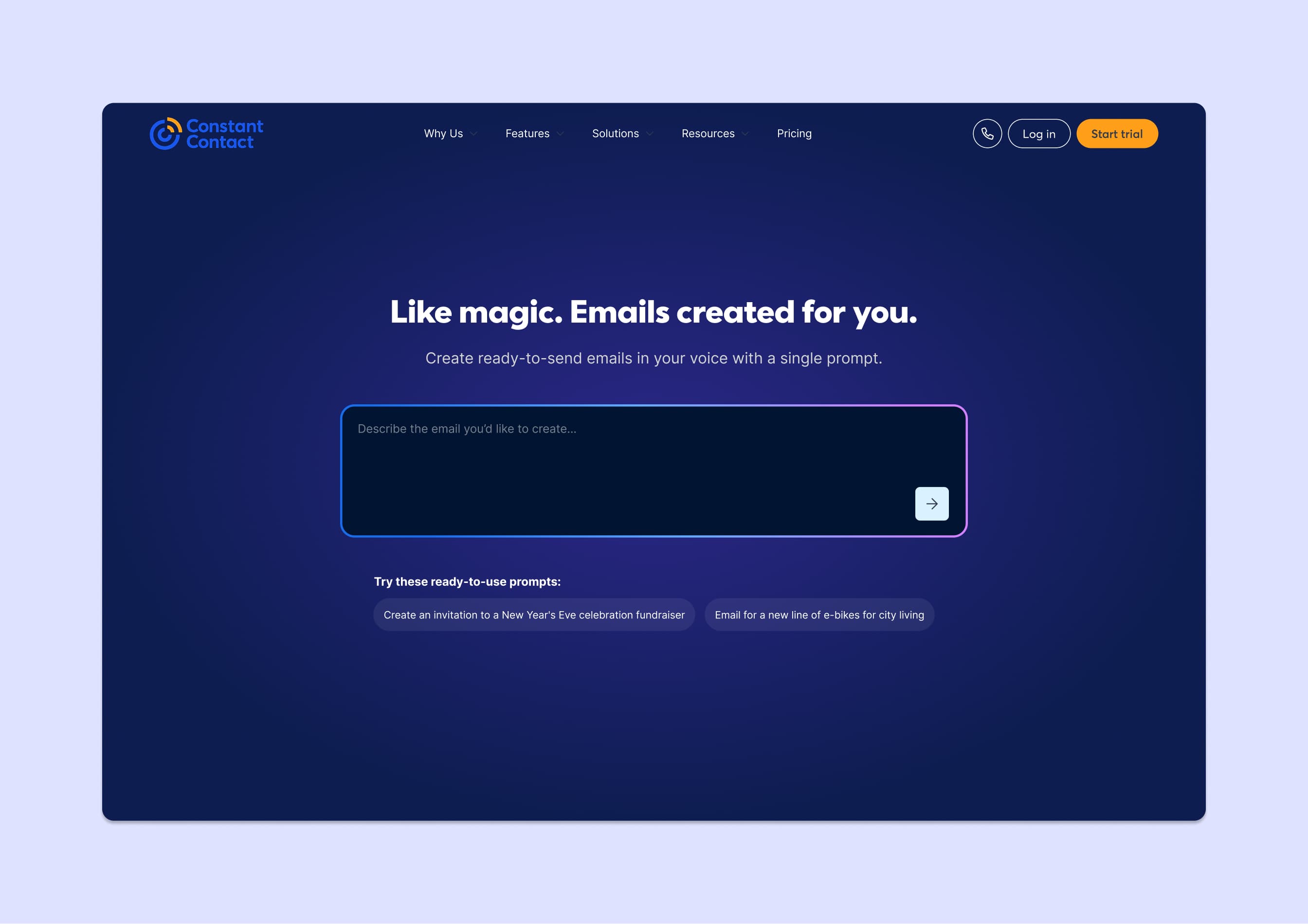
The hero image above and the wireframes below show the front-of-site (marketing website) entry points to the feature. The rest of this case study covers the in-app experience.
AI email generation that reduced creation time from 25 minutes to 4
I originated the concept for Prompt-to-Email based on a pattern I kept seeing in user research: people wanted templates that sounded like their business, not generic marketing language. The existing template library had thousands of options, but none of them felt personal.
I worked with the AI team on how to train the model, collaborated on the structured output system, and made a positioning decision that changed adoption. The feature shipped after I moved to a different team, and it became one of the highest-used capabilities on the platform.
My Role
- Product Design
- AI/ML Collaboration
- UX Strategy
Team
- AI engineering team
- Product manager
- Email designer
- UXR
Tools
- Figma
- Snowflake
- Statsig
- Notion
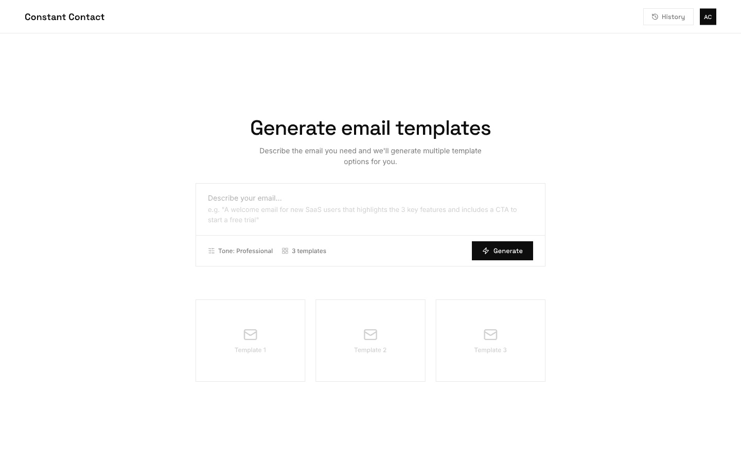
In-app prompt input: users describe the email they need, choose a tone, and generate multiple template options.
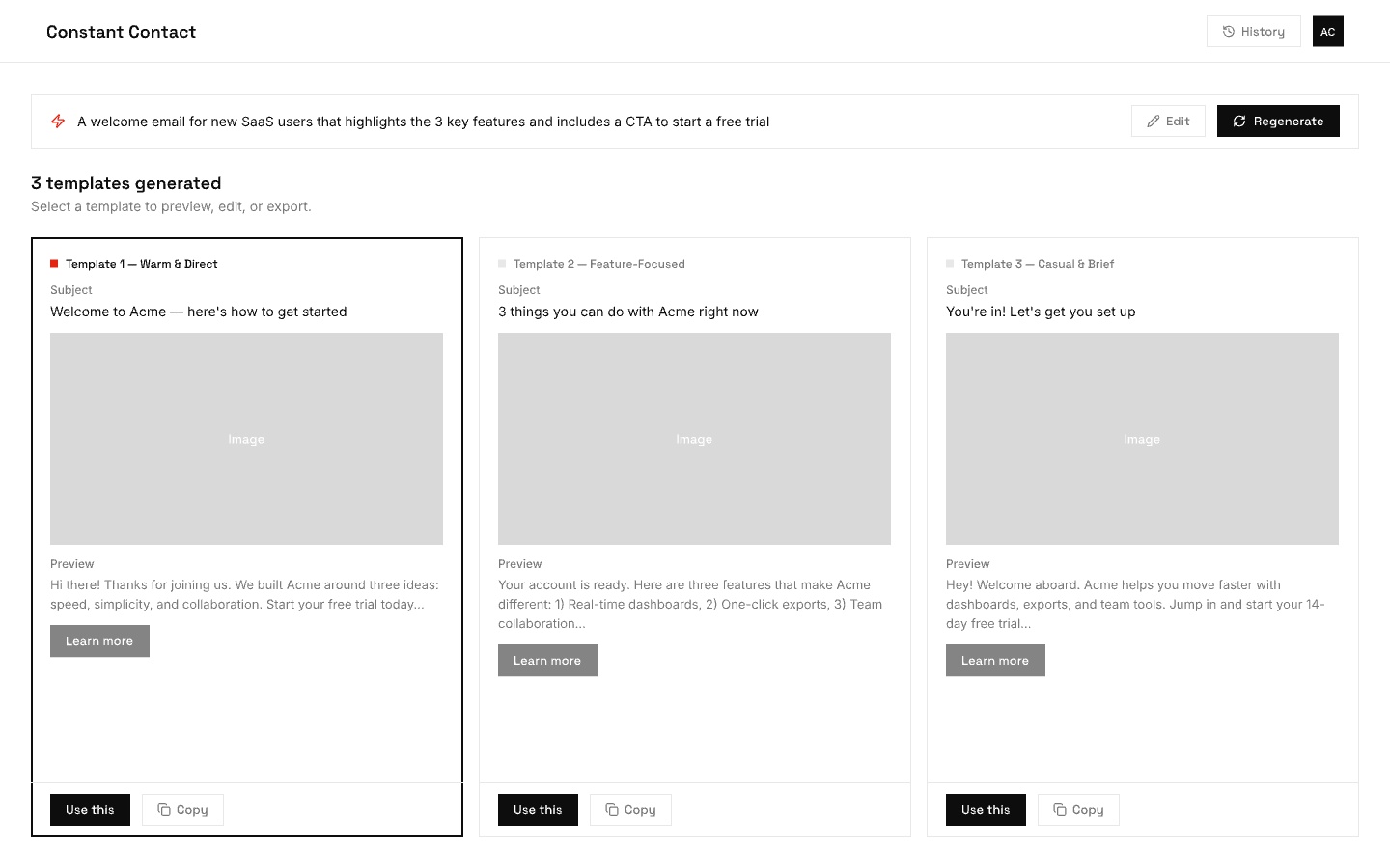
Results view: three generated templates with distinct tones. Users can preview, select, or regenerate.
The Problem
Creating an email from scratch took an average of 25 minutes for first-time users. The blank canvas was intimidating, templates felt generic, and the gap between "I want to send something" and "I have something ready to send" was where most trial users gave up.
UXR confirmed the pattern: users wanted emails that reflected their tone, their content, their brand. The template library had volume but no personalization. A user selling handmade candles and a user running a dental practice got the same starting point.
The Thinking
My original vision was broader than what shipped. The first version included a site-scraping layer that would identify a user's website, pull brand colors, logo, images, and writing tone, and build a profile before any email was generated. This worked hand-in-hand with BrandKit and was the intelligent foundation for both.
The site-scraping component was deprioritized because the vector system required to power it wasn't development-ready. The team narrowed focus to the prompt-generation layer: give users an input field, let them describe what they want, and generate multiple email versions from that prompt.
The harder problem was upstream: teaching the model how to construct a well-formed email. I worked with engineering and an email designer on the earliest prototype. The key question was how to give the model enough context about email structure to generate something actually usable. The solution was to use Constant Contact's own database of emails along with their performance metrics. Emails with the highest conversion rates became the training signal for format, structure, and construction patterns.
Challenges & Considerations
Working this closely with the AI team meant navigating decisions that most product designers never encounter. These were some of the core tensions we worked through together.
Prompts
Every AI interaction starts with two layers of instructions: a system prompt (background context set by the developer, like "you are an email copywriter for small businesses") and the user message (what the person actually types). As a designer, I had to decide how much of this to expose. We hid the system prompt entirely and showed only a simple input field. Power users never needed to see the scaffolding underneath.
Parameters
Beyond the prompt, there are numeric settings that shape the model's output. The most common is temperature, essentially a creativity dial. Low temperature produces focused, predictable copy. High temperature produces more varied, sometimes surprising results. We chose to keep these hidden from users entirely. For a product where consistency and trust mattered more than creative experimentation, exposing raw numbers or even friendly labels like "creative" vs. "precise" would have added complexity without clear value.
Evaluation
Once the model produces an email, how do you know if it's good? Early on, we relied on thumbs up/down feedback from users. That was a start, but vague. A thumbs down didn't tell the team whether the tone was off, the email was too long, or the content was factually wrong. We pushed toward more specific categories so the AI team could trace failure modes back to the training data and prompt structure.
Latency vs. Quality
Bigger, smarter models produce better emails but take longer and cost more per request. Smaller models are fast and cheap but make more mistakes. This created a real product decision. The team used streaming to display the response word-by-word so it felt fast even when generation took several seconds. That perception of speed was critical for a demographic already skeptical of AI. If the feature felt slow on top of feeling unfamiliar, adoption would have stalled.
The images below show the shipped in-app experience.
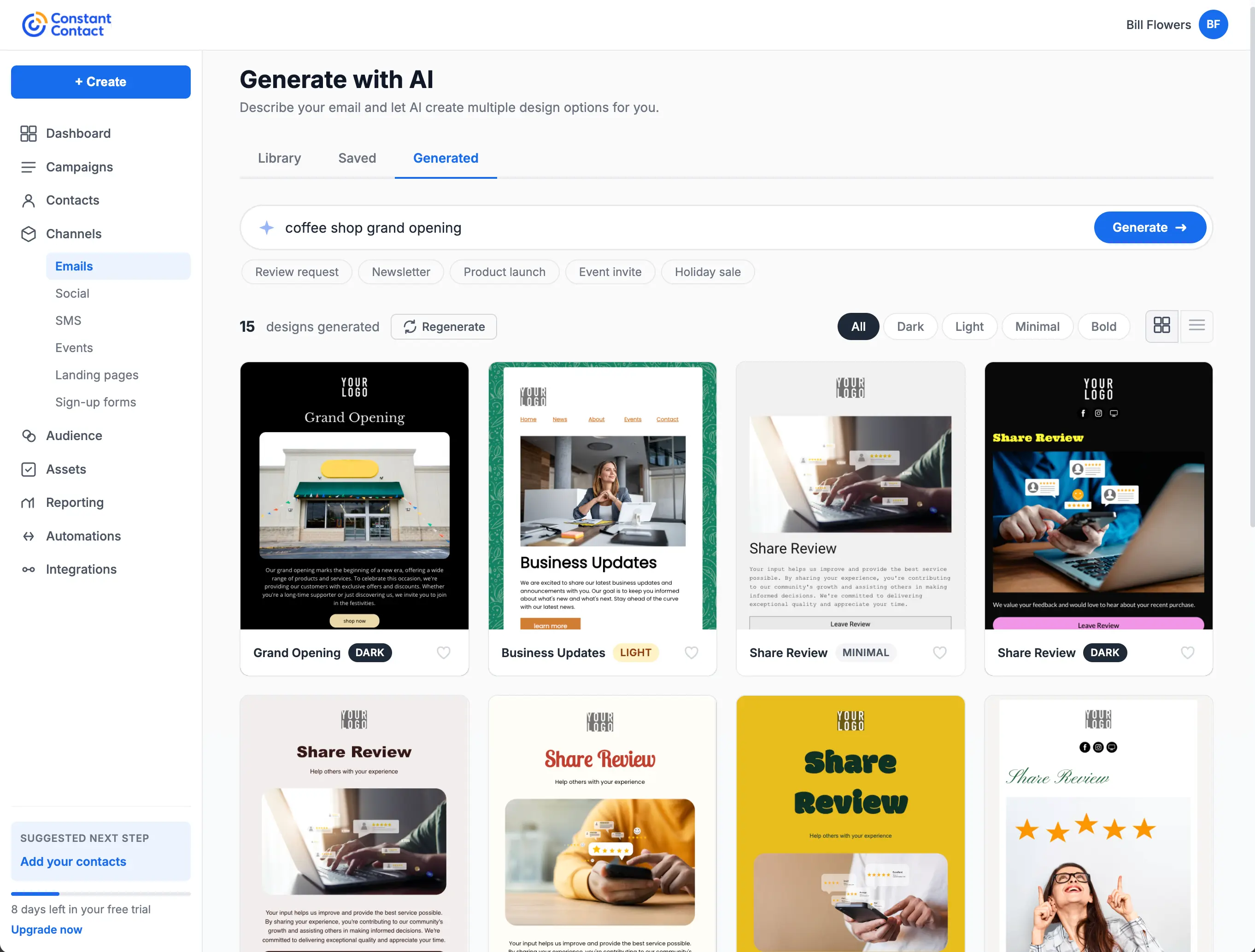
The shipped generation view: users enter a prompt, filter by style (Dark, Light, Minimal, Bold), and browse generated designs in a grid. Category tags like Review request and Newsletter help narrow results.
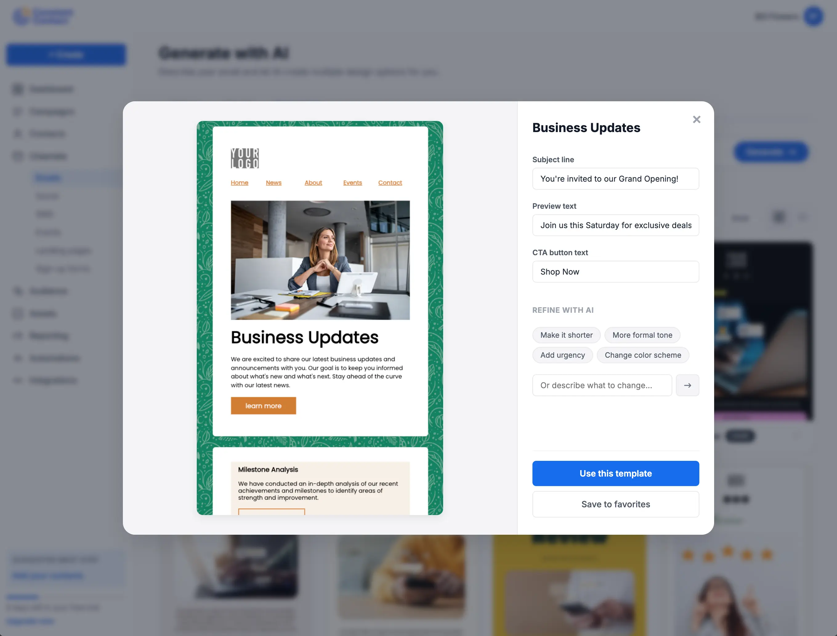
Preview and refine: selecting a template opens a detail view with quick edits for subject line, preview text, and CTA. AI refinement chips let users adjust tone, length, urgency, or color scheme without starting over.
The Search Reframe
This was my most impactful contribution to the feature. Through UXR, the team found that Constant Contact's core demographic (45+) was turned off by AI generation framing. "Generate an email" felt unfamiliar and untrustworthy.
I suggested repositioning the prompt input as a search field rather than an AI tool. Instead of "describe what you want AI to generate," it became "search for the email you want to create." This repositioning transformed Constant Contact from a company with a limited template library into a platform where users could find a template for anything they could think to search for. Usage increased significantly after the reframe.
The insight came from years of observing how the CTCT demographic interacts with new technology. They're comfortable with search. They're skeptical of generation. Meeting them where they were, rather than asking them to adopt new mental models, was the right call.
Builder Packs
After I moved to the mobile app team, the AI team developed builder packs: modular email sections (header, intro, CTA, footer, etc.) that could be assembled in different orders based on email best practices. The LLM parsed these sections, understood their role in the email structure, and composed them based on the user's prompt. This was the production implementation of the architecture I had scoped in research and early collaboration.
When the simplified mWeb editor launched later, it had a template gap. Prompt-to-email filled it entirely, giving mobile users a way to generate a complete email without needing a template at all. It solved both the template problem and the blank-canvas problem simultaneously.
Outcome
Reduced average email creation time from 25 minutes to under 4 for first-time users. Became the primary entry point for 38% of new email campaigns in the FOS tier. Users who started with AI-generated content had a 52% higher send-completion rate compared to those starting from a blank template, directly improving the platform's core activation metric.
Reflection
The search reframe is the detail I keep coming back to. It's a small UX decision with outsized impact, and it only happened because the team was paying attention to qualitative signals alongside the quantitative ones. The tradeoff worth noting: a limited number of builder packs means similar layouts can surface for different searches. That's a known iteration point, but the core behavior shift validated the approach. This project also demonstrated working upstream with AI/ML teams on how a model is trained, not just how the UI looks.