Mobile Web Activation

Constant Contact · PLG Growth

Turning mobile traffic into $861K in annual revenue.

Mobile web was pulling significant trial traffic from paid ads, but there was no activation path. Users would land, look around, and leave. I designed a gamified onboarding experience from scratch that walked users through every activation step: email verification, address entry, contact import, and sending their first campaign. Our growth team shipped it as an A/B test across 25,469 users. Email sends lifted 10.6%, email verification improved 4.8%, and converters in the test group chose higher-value plans, producing an estimated $861K in annual revenue impact.

Email sends

+10.6%

Annual revenue impact

+$861K

Email verification

+4.8%

My Role

  • Product Design
  • UX Strategy
  • Interaction Design

Team

  • PLG growth
  • Experimentation

Tools

  • Figma
  • Notion
  • Statsig
  • Cursor
  • Snowflake MCP

The Problem

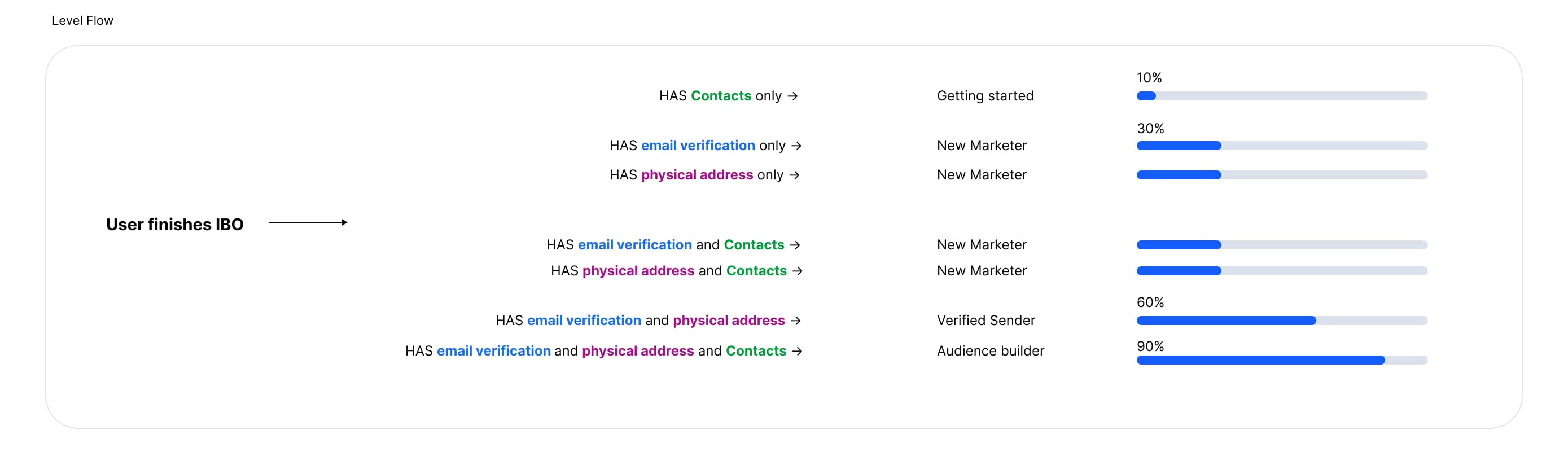
Activation at Constant Contact means a trial user reaches "send-ready" status. They've verified their email, added a physical address, imported contacts, and created and sent email campaigns. Users who hit that bar convert to paid at dramatically higher rates. It's the single most important behavioral milestone in the trial funnel.

On desktop, each of those steps had a dedicated flow. On mobile web, most of them didn't exist. Users would land from an ad, look around, and leave. Pages redirected into desktop-oriented views that weren't usable on a phone. There was no sequencing, no guidance, and no way to complete the activation path.

When I joined the PLG Growth team in November 2024, the mandate was clear: move Activation and Trial-to-Paid conversion. Mobile web was the obvious starting point. Significant ad-driven traffic, zero activation infrastructure.

The Hypothesis

Our growth team hypothesized that a clear, step-by-step activation path would improve both activation rate and downstream conversion. The team, three PMs, five engineers, and myself as the designer, aligned on the approach, scoped feasibility, and instrumented metrics so we could call the experiment within two to three weeks of traffic.

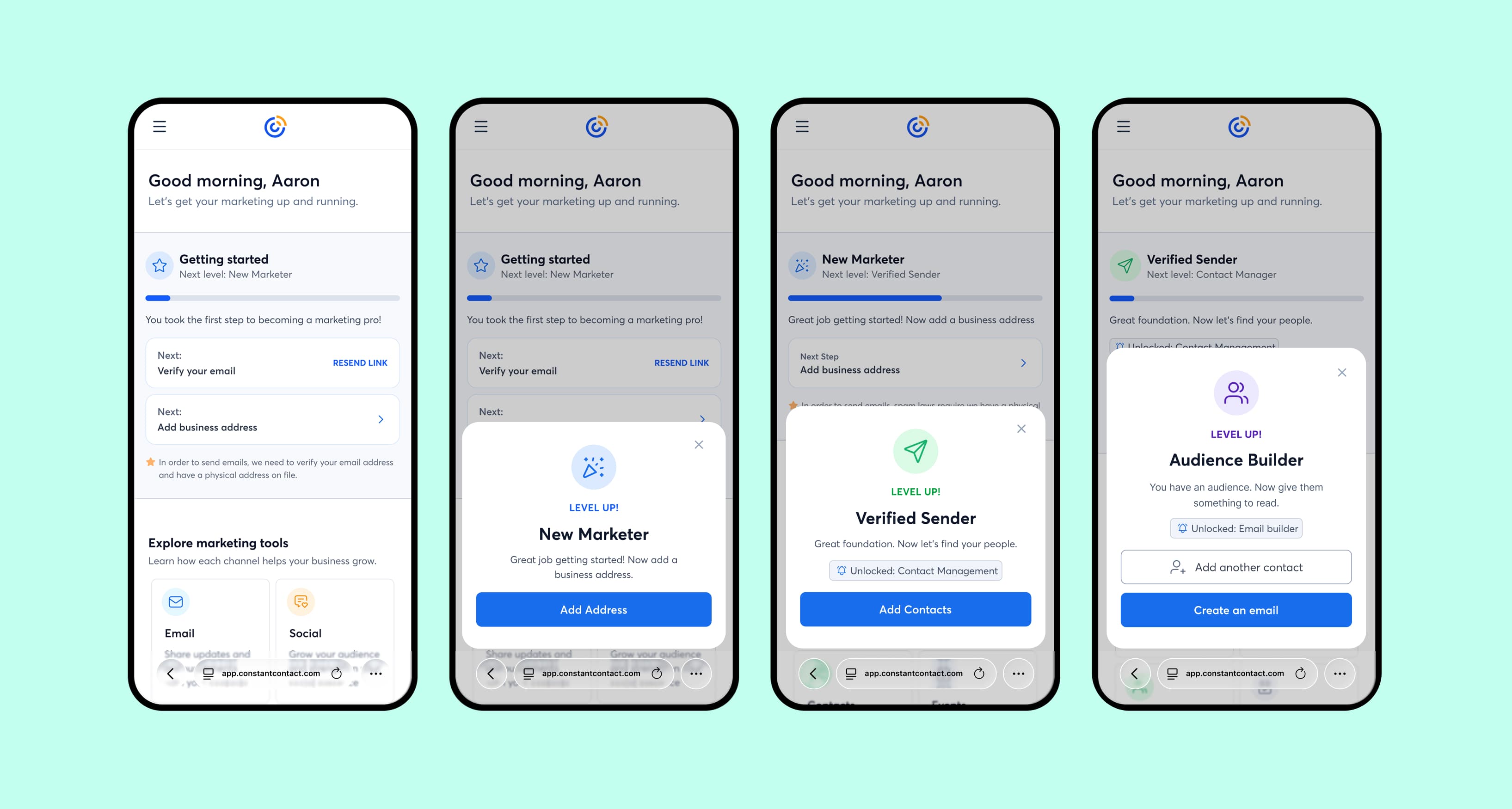
A simple checklist wouldn't be enough. These are small business owners thinking about their next sale, not configuring an email platform. I pushed for gamifying the setup process: rewarding each completed step, making the next action obvious, and showing users how close they were to being done. The bet was that progression mechanics would push completion rates higher than a standard onboarding flow.

Clearing the Path

I started with a full audit of the mobile web experience. Every page that didn't contribute to trial activation got cut or reworked. Redirect traps, desktop-oriented dead ends, pages that technically loaded but weren't usable on a phone. The goal was to strip away everything that could stall a new user before they reached a send-ready state.

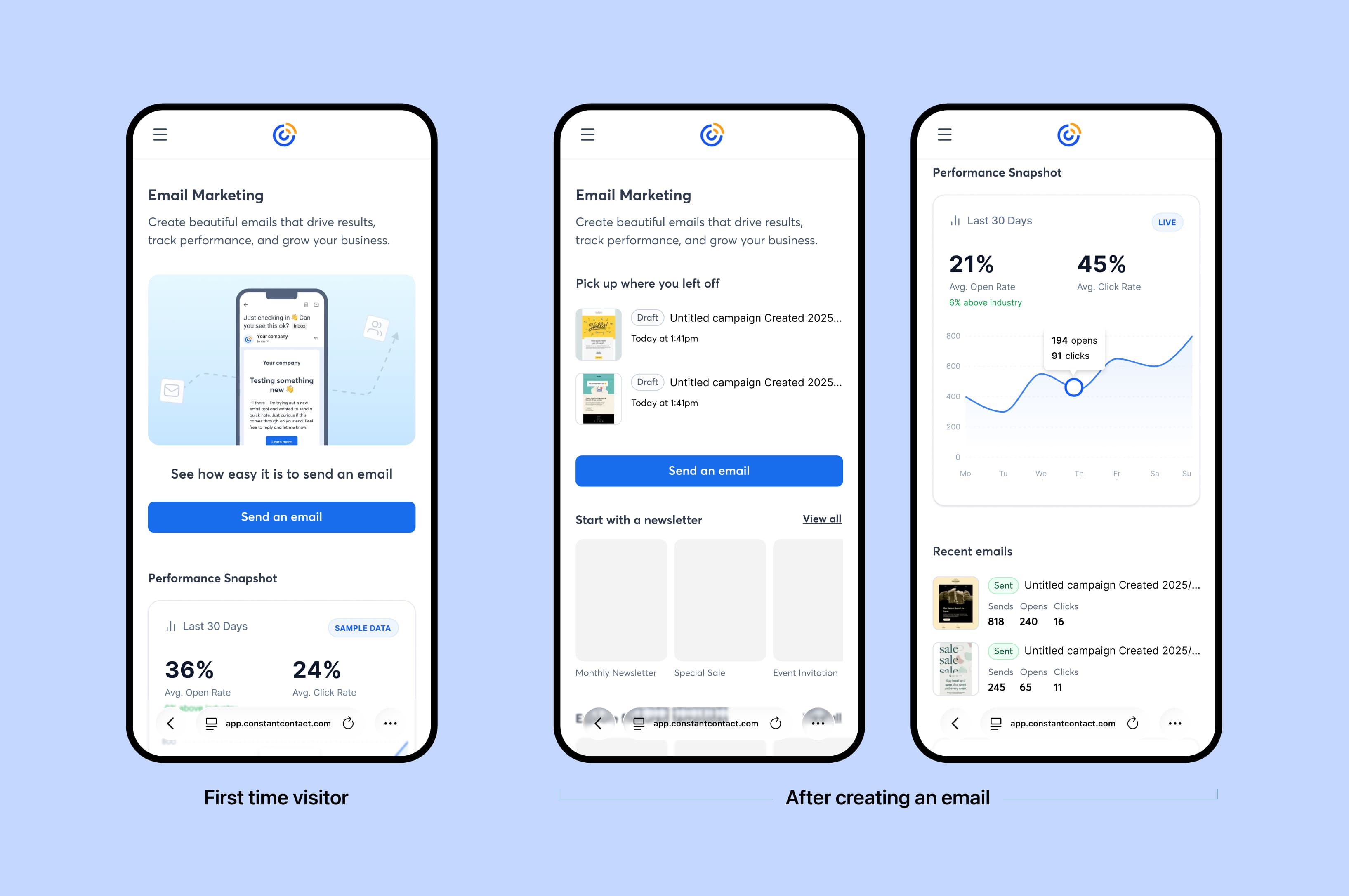
There was one hard blocker: mobile web had no email editor. You can't ask users to send emails if they can't compose one. Our team built and shipped the mobile email editor as a prerequisite, validating it as a standalone experiment before moving on to the broader activation experience.

Designing the Progression System

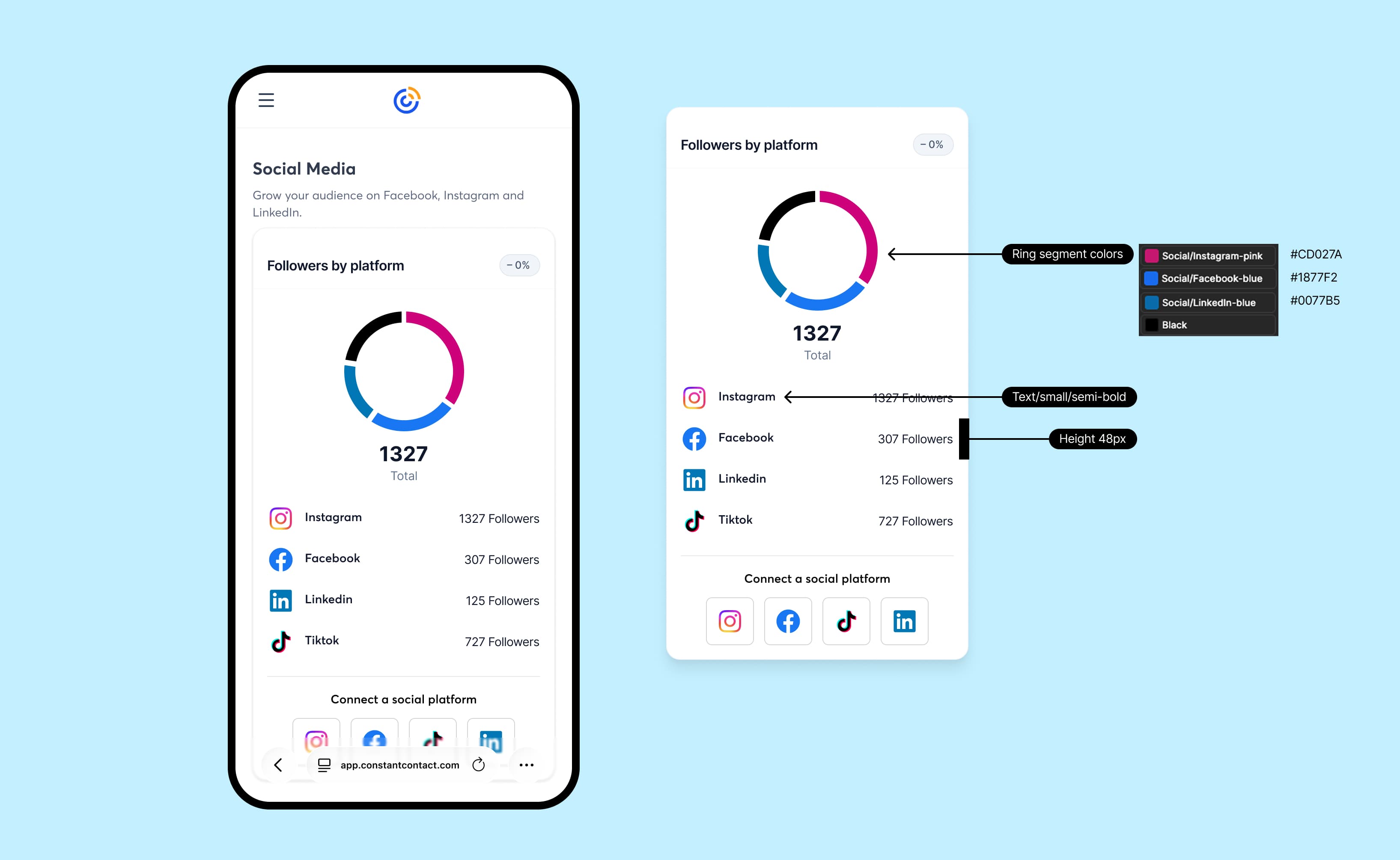
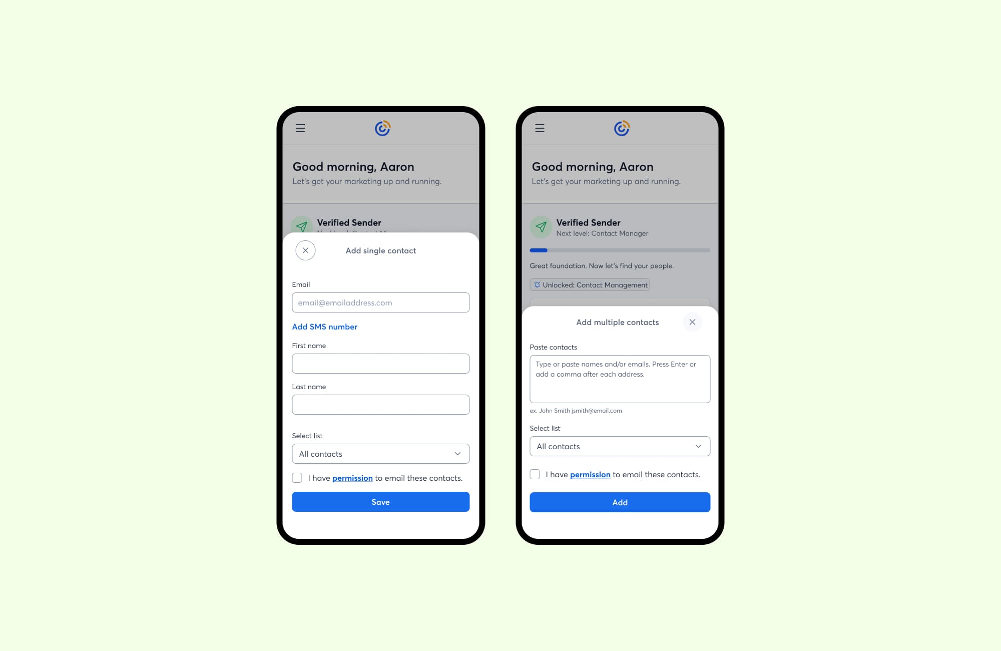
With the editor in place, I designed a progression system that stepped users through activation as a series of levels. Each completed prerequisite (verify email, add address, import contacts, create an email, send it) triggered a level-up moment and presented the next step. Each level was its own moment, designed to feel like progress.

The per-step architecture was intentional. Individual levels could later expand into multi-step sequences with their own XP bars. For the initial experiment, each level was a single action, but the system was built to support the depth we were planning.

Engineering and I partnered closely on how progression state would persist across sessions, how level-up animations would fire without blocking the flow, and how the system would scale as we expanded it.

Level flow diagram mapping prerequisite completion to user progression tiers

Each activation prerequisite maps to a progression tier, from Getting Started through Audience Builder

Mobile UI showing the four-stage level-up progression system

The progression system as users experience it, with level-up moments after each completed step

Simplifying the Email Surface

The email page was the most important surface in the experiment. The previous version showed a generic marketing overview with no clear entry point. I redesigned it to adapt based on where the user was in their journey.

A new user sees one action: create an email. After drafting, the page shifts to show in-progress work with a prominent send button. After sending, it becomes a performance view. The page always reflects what the user should do next.

Email page showing three states: first-time visitor, after creating an email, and performance view

The email page adapts as users progress, from first visit through creation to performance tracking

Rethinking Contacts

Adding contacts is a prerequisite for sending, but the existing flow treated it as a standalone feature. Users landed on a full contact management screen before they had any contacts to manage.

I simplified it into a focused add-contacts flow that surfaced at the right moment in the progression. Users could quickly add a contact manually, paste a list, or pull from Google Contacts. The goal was to get them past the gate without it feeling like a separate task.

Contacts management showing list view, quick add flow, and Google import integration

The contacts experience: list view, quick add, and third-party import options

Extending the Framework

We applied the same activation-first approach to other channel surfaces, including social. At the time of this experiment, social posting wasn't available on mobile web because the platform didn't support it yet. So the scope was intentionally limited: users could connect accounts and see follower counts, but couldn't create posts.

Even with that constraint, the design followed the same pattern as email: clear primary action, relevant data, and nothing extraneous. The goal was to establish the surface and collect signal on engagement, so we could make informed decisions about what to build next.

Social media management page with follower analytics and platform breakdown

The social surface at launch: account connection and follower analytics, scoped to what the platform supported

What This Was Really About

This project served two purposes beyond the metrics. First, getting users to value faster: reaching a send-ready state before their trial expires.

Second, establishing trust. Our users rely on us to handle the hard parts of marketing. This activation path was a first step in that relationship: clear next actions, progress acknowledgment, and a path that doesn't let users get lost.

Results

The experiment ran as an A/B test through Statsig from December 22, 2025 to January 27, 2026. Control group: 12,670 users on the original experience. Test group: 12,799 users on the gamified activation path.

Sending improved across every depth bucket, with the biggest gain in first-time senders. Second login also improved, meaning users were coming back to continue where they left off. The experience gave people a reason to return.

Email Sending

The core activation behavior. The simplified experience drove a +10.6% lift in email sends, with the strongest gains in first-time senders (+12.7%) and power senders (+16.9%). Second email sends were roughly flat, suggesting the lift came from getting more users to their first send and encouraging repeat behavior.

+10.6%

Sent any email (13.9% → 15.4%)

+12.7%

Sent first email (8.4% → 9.4%)

-1.4%

Sent second email (2.8% → 2.8%)

+16.9%

Sent 3+ emails (2.7% → 3.2%)

0%4%8%12%16%20%Sent anySent exactly 1Sent exactly 2Sent 3+ControlTest

Funnel and Engagement

Email verification saw the single largest metric improvement across all three experiments (+4.8%), and physical address completion rose +2.8%. The simplified flow reduced the steps between landing and completing these critical setup milestones. Second login also improved, a signal that users are returning to continue their progression.

+4.8%

Email verified (66.5% → 69.7%)

+2.8%

Physical address (66.4% → 68.2%)

+1.8%

Second login (45.5% → 46.3%)

+0.2%

Email created (30.6% → 30.6%)

0%20%40%60%80%100%Email verifiedPhysical addressSecond loginControlTest

Revenue Impact

Conversion was essentially flat (-0.3%), but test converters chose higher-tier plans, resulting in +6.7% higher ELTV ($609 vs $571). The net effect: +$6.64 in lifetime value per exposed user, translating to an estimated +$861K in annual revenue at scale.

-0.3%

T2P conversion (18.4% → 18.3%)

+6.7%

ELTV per converter ($571 → $609)

+$861K

Est. annual revenue impact

0%4%8%12%16%20%04080120160200T2P conversionELTV per exposed userELTV ($)ControlTest

Trade-offs and Iterations

Conversion was essentially flat (-0.3%), which initially seemed underwhelming. But the ELTV data told a different story: test converters were choosing higher-tier plans at a 6.7% higher rate ($609 vs $571). The net revenue per exposed user was +$6.64, which at scale translates to the largest estimated revenue impact of all three experiments.

Contact addition depth was mixed. MEQ-2 contacts improved (+7.9%), but MEQ-3 (3+ contacts) dropped 5.3%. The initial design surfaced a single "add contact" sheet that made it easy to add one or two contacts but didn't encourage bulk importing. We addressed this in a follow-up iteration with a multi-paste flow where users can copy and paste emails directly, and the system parses and adds them automatically.

Comparison of single contact add sheet versus the multi-contact paste iteration

Left: the initial single-contact sheet. Right: the follow-up iteration with multi-contact paste support.

Reflection

Before this project, mobile web was treated as a limited version of desktop where most things didn't work. After it, the team had evidence that a purpose-built mobile experience with its own sequencing could move activation metrics that the desktop-derived version never touched.

The experiment was called a success and recommended for continued iteration. We used the data to prioritize the contacts multi-paste fix, then moved on to other friction points in the activation flow, each scoped as its own hypothesis and shipped incrementally.

The bigger takeaway was about the framework. The progression system gave us a structure we could extend: new activation steps, deeper multi-step levels, and eventually a foundation for onboarding across other surfaces. The architecture supported that from the start, and the results justified continued investment.

If I were to keep pushing on this, the next priorities would be:

  1. Measuring long-term retention for users who activated through the mobile web path, to confirm faster activation leads to sustained engagement.
  2. Expanding mobile web capabilities (social posting, deeper campaign management) using the activation framework as the onboarding layer for each new surface.
  3. Isolating the gamification signal. The experiment proved the full package works, but we don't yet know how much lift comes from progression mechanics versus the structural simplification.
  4. Solving the physical address problem. Many small businesses don't have a mailing address ready at signup. Clearer UX can't fix that if the information doesn't exist yet. Future experiments could explore delayed collection or letting users proceed and prompting them closer to their first send.