Contacts experiments

Improving the contacts upload experience for trial users

My Role

Product Design

UX Strategy

Interaction Design

Team

PLG growth

Experimentation

Tools

Figma

Notion

Statsig

Cursor

Snowflake MCP

Context

Within our PLG growth initiative, the team was tasked with identifying choke points across the product and systematically improving them through experimentation. One of those choke points was file-based contact upload.


File upload was not tied directly to activation, but it was a core behavior for active users attempting to grow their lists. Uploading a CSV is a common real-world workflow. However, users were dropping off at every stage of the flow.

The opportunity was clear: reduce friction in a high-intent moment to improve completion and list growth.

What We Changed and Why It Mattered

I led a friction-reduction redesign of the file upload flow, focusing on clarity, continuity, and forward movement. The goal was not to add features, but to remove cognitive overhead in a high-intent workflow.


We eliminated misleading completion signals, simplified the mapping interface, consolidated help content into contextual guidance, improved error states, and converted consent into an inline interaction to preserve momentum. Each change was designed to make the system state obvious and the next action unmistakable.


The result was a statistically significant +11.9% lift in file upload adoption, +8.6% increase in total contacts uploaded, and +7.9% increase in contacts per account. The experiment reached significance in two weeks and was rolled out to 100%.

Beyond performance gains, this work reinforced a broader product principle: lowering cognitive overhead in complex workflows materially improves completion.

Initial design analysis

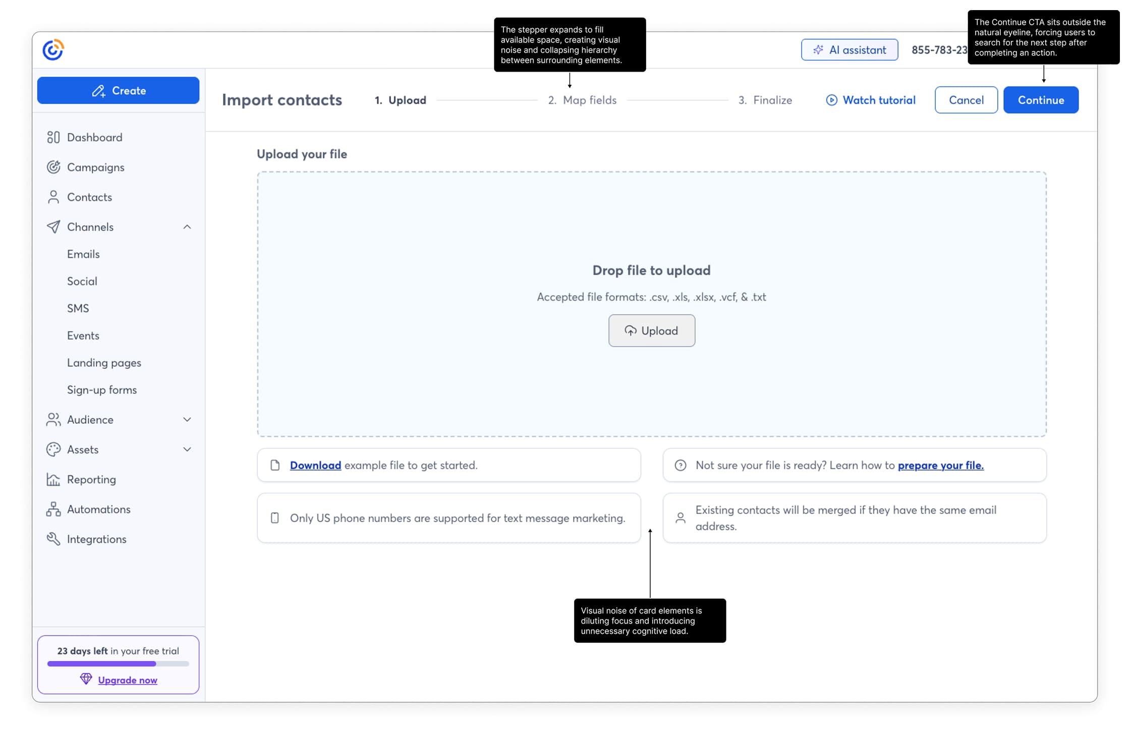
The initial upload screen

The stepper expands to fill available space, collapsing hierarchy and creating visual noise across the top of the page. At the same time, the Continue CTA sits outside the natural eyeline, forcing users to search for the next step while surrounding card elements add unnecessary cognitive load.

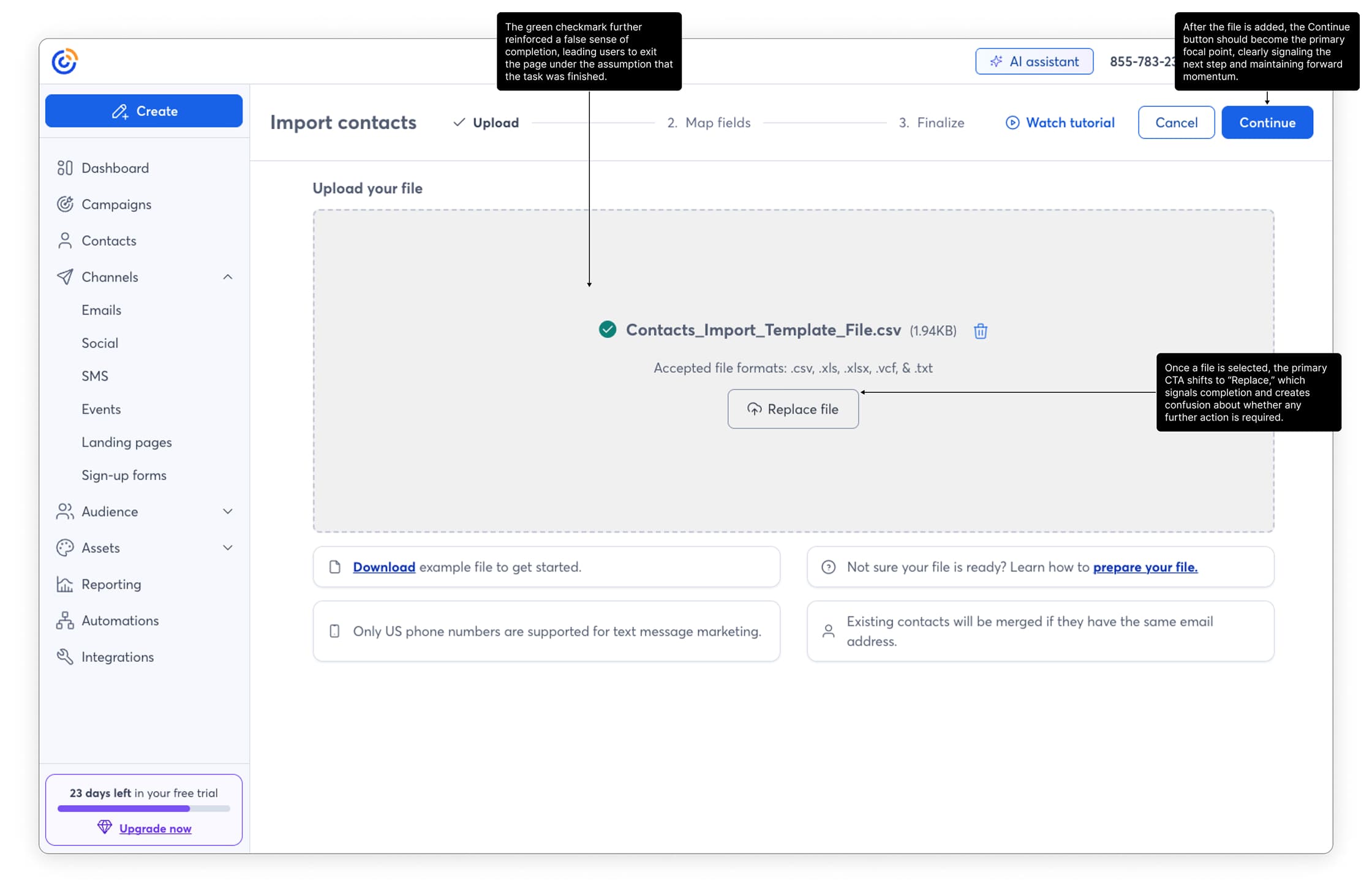
The page state after initial upload

After a file is selected, the green checkmark and the shift of the primary CTA to “Replace” signal completion, creating a false sense that the task is finished. As a result, users often exit without progressing because the Continue action lacks clear prominence and forward momentum.

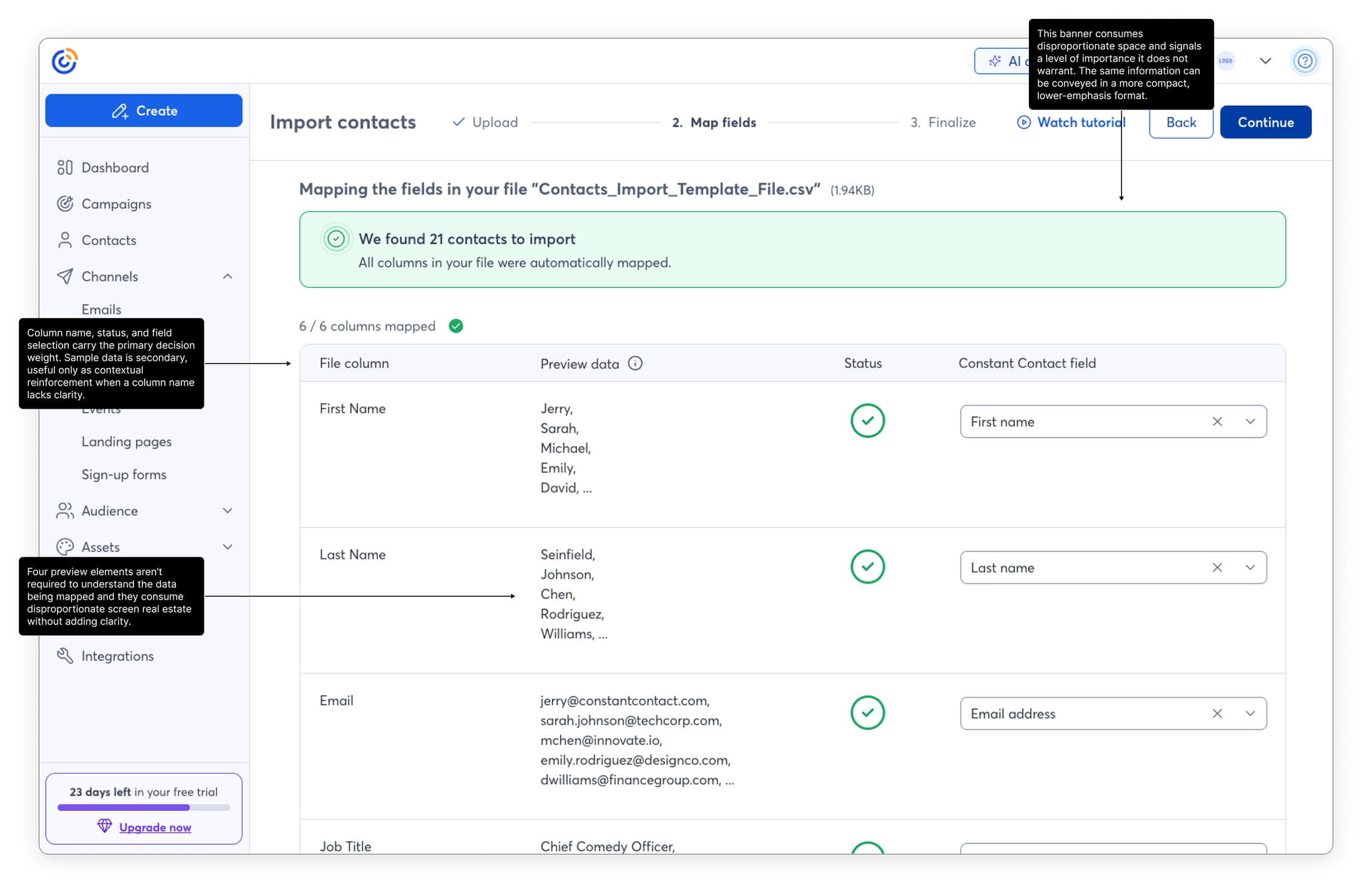
Initial mapping step

The banner overemphasizes a routine success state, consuming disproportionate space and drawing unnecessary attention. Within the table, column name, status, and field mapping drive the decision making, while multiple preview rows add visual weight without improving clarity.

Framing the problem

Through in-app analytics and coordinated user testing, we observed:

  • Significant drop-off across all upload steps
  • Confusion in the mapping interface
  • Misleading completion signals
  • Interruptive consent patterns
  • Weak forward-movement cues


The most damaging issue was a false completion signal. A green checkmark appeared after file selection, leading users to believe the task was complete. Many exited prematurely.


The flow lacked clarity, continuity, and strong next-step signaling. Users were forced to interpret system state instead of being guided through it.

This was not a single broken step. It was cumulative cognitive overhead.

Hypothesis

Turning Setup Into a Moment of Delight

We focused on making the first interaction memorable — the “aha” where the system automatically pulls a user’s logo and colors from their site. It’s the same emotional payoff as watching a photo filter click into place.

From there, everything cascades: colors propagate through templates, typography adjusts dynamically, and the user instantly sees a cohesive visual identity reflected across channels.

That instant transformation creates trust — not just in the product, but in their brand.

My role

Turning Setup Into a Moment of Delight

We focused on making the first interaction memorable — the “aha” where the system automatically pulls a user’s logo and colors from their site. It’s the same emotional payoff as watching a photo filter click into place.

From there, everything cascades: colors propagate through templates, typography adjusts dynamically, and the user instantly sees a cohesive visual identity reflected across channels.

That instant transformation creates trust — not just in the product, but in their brand.

Design Strategy

Rather than redesigning the entire architecture, we focused on friction reduction within the existing system.

Removed False Completion Signals

Replaced the misleading checkmark with progressive disclosure language that clearly indicated the next step.

Strengthened Forward Movement

Improved visibility of primary actions after file upload to eliminate ambiguity about what to do next.

Simplified Field Mapping

Reduced visual noise and improved clarity of column mapping to lower cognitive overhead.

Consolidated Help Resources

Removed scattered documentation and embedded contextual guidance inline.

Converted Consent to Inline Modal

Reduced flow interruption by handling consent within context rather than as a blocking step.

We also improved error states to clearly explain failed uploads and prevent silent friction.

Solution

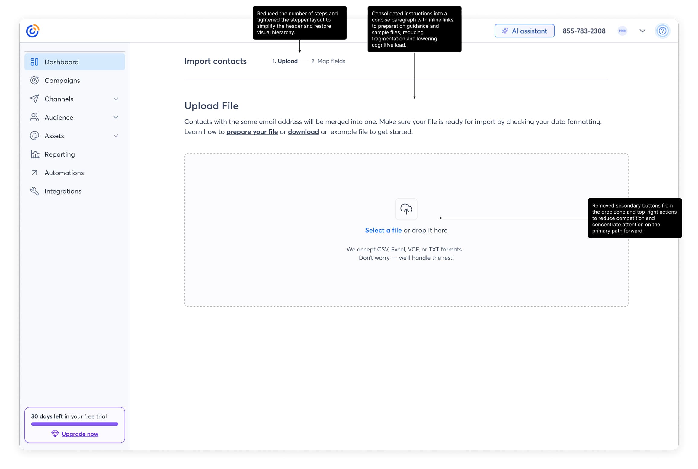
Revised upload screen

The header is simplified to restore hierarchy and reduce visual noise. Instructions are consolidated into a concise paragraph with inline support links to lower cognitive load. Secondary actions are removed so the upload interaction stands alone as the clear, primary path forward.

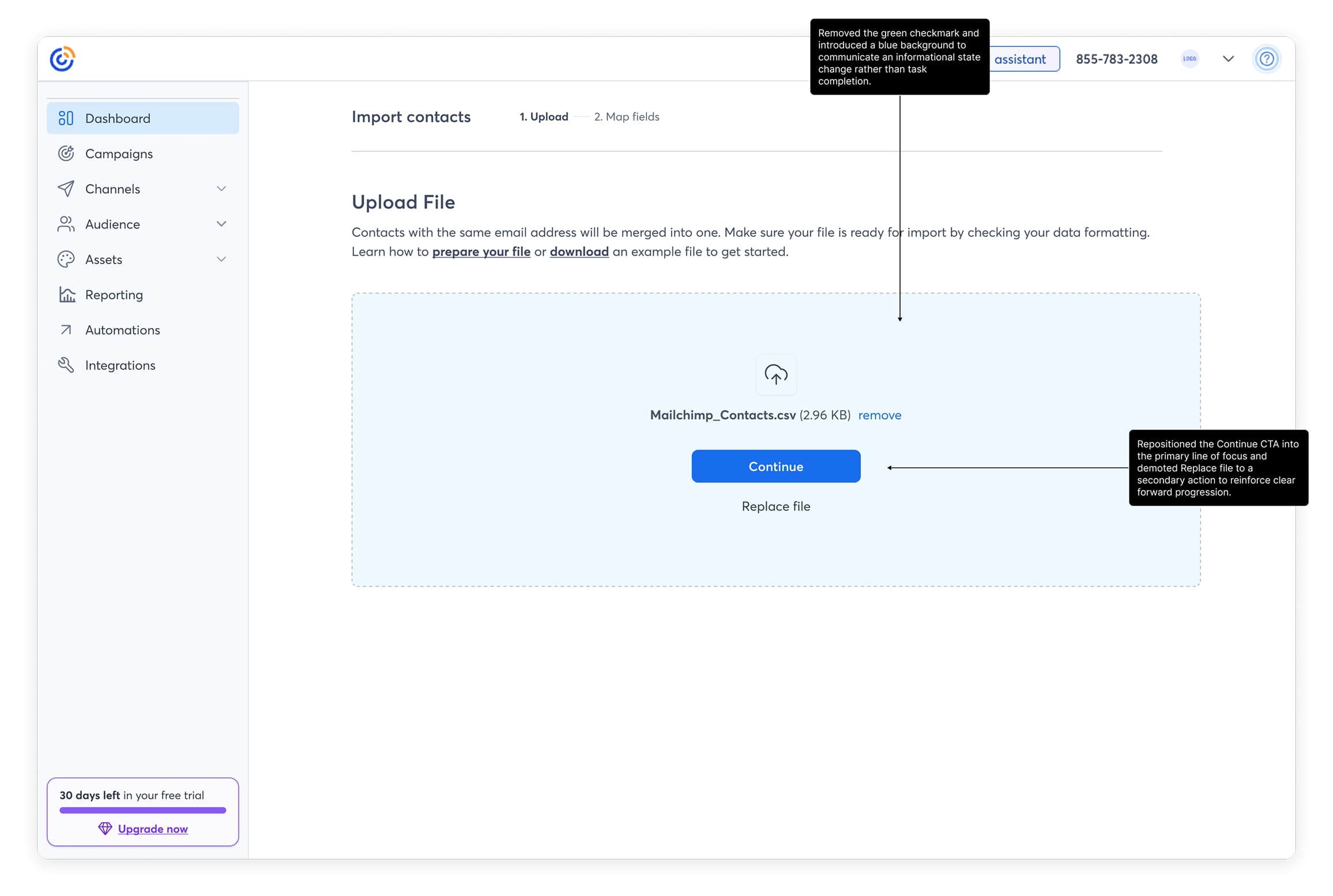
Revised state after upload

The state now communicates progress without implying completion. The success checkmark is removed in favor of a neutral informational treatment, and the Continue CTA is centered as the dominant action while Replace is clearly secondary, reinforcing forward movement and reducing ambiguity.

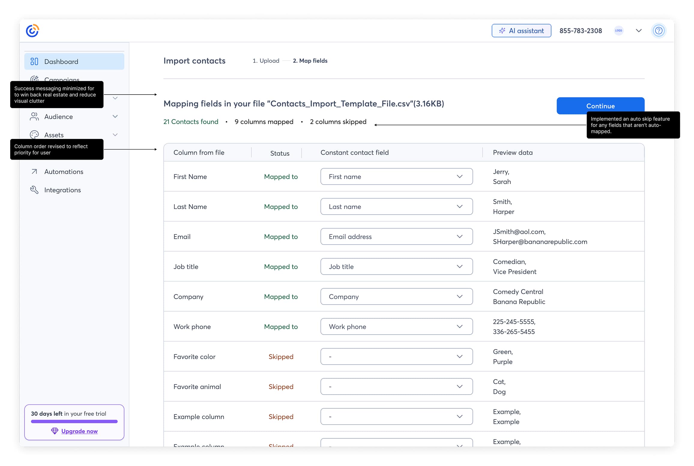
Update mapping step

The columns now prioritize what matters most, column name, status, and mapping come first, with preview data playing a lighter supporting role. Preview samples are trimmed down to avoid wasting space. The header and success state are consolidated into a simple summary that keeps feedback clear without overpowering the screen.

Business Impact

Experiment Design

  • Direct traffic only
  • Excluded spam and reporting-excluded accounts
  • 3,565 accounts analyzed
  • Experiment ran 2.5 weeks
  • Statistical significance reached around week 2

Primary KPIs:

  • % Accounts Using File Upload
  • Total Contacts Uploaded via File
  • Avg Contacts per Account

All measured at the account level and attributed post-exposure.

Experiment Design

Experiment Design

  • Direct traffic only
  • Excluded spam and reporting-excluded accounts
  • 3,565 accounts analyzed
  • Experiment ran 2.5 weeks
  • Statistical significance reached around week 2

Primary KPIs:

  • % Accounts Using File Upload
  • Total Contacts Uploaded via File
  • Avg Contacts per Account

All measured at the account level and attributed post-exposure.

Results

+11.9%

Accounts using file upload

+8.6%

Total contacts uploaded

+7.9%

Average contacts per account

Organizational Impact

Experiment Design

  • Direct traffic only
  • Excluded spam and reporting-excluded accounts
  • 3,565 accounts analyzed
  • Experiment ran 2.5 weeks
  • Statistical significance reached around week 2

Primary KPIs:

  • % Accounts Using File Upload
  • Total Contacts Uploaded via File
  • Avg Contacts per Account

All measured at the account level and attributed post-exposure.

I design for teams that care about doing it right

Get in touch, or send me a cat video

Contacts experiments

Improving the contacts upload experience for trial users

My Role

Product Design

UX Strategy

Interaction Design

Team

PLG growth

Experimentation

Tools

Figma

Notion

Statsig

Cursor

Snowflake MCP

Context

Within our PLG growth initiative, the team was tasked with identifying choke points across the product and systematically improving them through experimentation. One of those choke points was file-based contact upload.


File upload was not tied directly to activation, but it was a core behavior for active users attempting to grow their lists. Uploading a CSV is a common real-world workflow. However, users were dropping off at every stage of the flow.

The opportunity was clear: reduce friction in a high-intent moment to improve completion and list growth.

What We Changed and Why It Mattered

I led a friction-reduction redesign of the file upload flow, focusing on clarity, continuity, and forward movement. The goal was not to add features, but to remove cognitive overhead in a high-intent workflow.


We eliminated misleading completion signals, simplified the mapping interface, consolidated help content into contextual guidance, improved error states, and converted consent into an inline interaction to preserve momentum. Each change was designed to make the system state obvious and the next action unmistakable.


The result was a statistically significant +11.9% lift in file upload adoption, +8.6% increase in total contacts uploaded, and +7.9% increase in contacts per account. The experiment reached significance in two weeks and was rolled out to 100%.

Beyond performance gains, this work reinforced a broader product principle: lowering cognitive overhead in complex workflows materially improves completion.

Initial design analysis

The initial upload screen

The stepper expands to fill available space, collapsing hierarchy and creating visual noise across the top of the page. At the same time, the Continue CTA sits outside the natural eyeline, forcing users to search for the next step while surrounding card elements add unnecessary cognitive load.

The page state after initial upload

After a file is selected, the green checkmark and the shift of the primary CTA to “Replace” signal completion, creating a false sense that the task is finished. As a result, users often exit without progressing because the Continue action lacks clear prominence and forward momentum.

Initial mapping step

The banner overemphasizes a routine success state, consuming disproportionate space and drawing unnecessary attention. Within the table, column name, status, and field mapping drive the decision making, while multiple preview rows add visual weight without improving clarity.

Framing the problem

Through in-app analytics and coordinated user testing, we observed:

  • Significant drop-off across all upload steps
  • Confusion in the mapping interface
  • Misleading completion signals
  • Interruptive consent patterns
  • Weak forward-movement cues


The most damaging issue was a false completion signal. A green checkmark appeared after file selection, leading users to believe the task was complete. Many exited prematurely.


The flow lacked clarity, continuity, and strong next-step signaling. Users were forced to interpret system state instead of being guided through it.

This was not a single broken step. It was cumulative cognitive overhead.

Hypothesis

If we simplified the workflow, reduced cognitive load, and strengthened forward movement cues, we would:

  • Increase file upload completion
  • Increase contact volume per account
  • Improve downstream send behavior

The growth team formed the original hypothesis. I contributed to shaping the UX direction and validating that our metric definitions accurately reflected user behavior.

My role

  • Design lead embedded within a dedicated growth pod
  • Partnered directly with 2 PMs and 4 engineers
  • Contributed to hypothesis refinement
  • Pressed on metric validation and statistical confidence
  • Led UX strategy and execution within the RISE design system

Our team reported directly to the Chief Growth Officer, and experiments with signal influenced roadmap priority.

Design Strategy

Rather than redesigning the entire architecture, we focused on friction reduction within the existing system.

Removed False Completion Signals

Replaced the misleading checkmark with progressive disclosure language that clearly indicated the next step.

Strengthened Forward Movement

Improved visibility of primary actions after file upload to eliminate ambiguity about what to do next.

Simplified Field Mapping

Reduced visual noise and improved clarity of column mapping to lower cognitive overhead.

Consolidated Help Resources

Removed scattered documentation and embedded contextual guidance inline.

Converted Consent to Inline Modal

Reduced flow interruption by handling consent within context rather than as a blocking step.

We also improved error states to clearly explain failed uploads and prevent silent friction.

Solution

Revised upload screen

The header is simplified to restore hierarchy and reduce visual noise. Instructions are consolidated into a concise paragraph with inline support links to lower cognitive load. Secondary actions are removed so the upload interaction stands alone as the clear, primary path forward.

Revised state after upload

The state now communicates progress without implying completion. The success checkmark is removed in favor of a neutral informational treatment, and the Continue CTA is centered as the dominant action while Replace is clearly secondary, reinforcing forward movement and reducing ambiguity.

Update mapping step

The columns now prioritize what matters most, column name, status, and mapping come first, with preview data playing a lighter supporting role. Preview samples are trimmed down to avoid wasting space. The header and success state are consolidated into a simple summary that keeps feedback clear without overpowering the screen.

Business Impact

Direct traffic only

  • Excluded spam and reporting-excluded accounts
  • 3,565 accounts analyzed
  • Experiment ran 2.5 weeks
  • Statistical significance reached around week 2

Primary KPIs:

  • % Accounts Using File Upload
  • Total Contacts Uploaded via File
  • Avg Contacts per Account

All measured at the account level and attributed post-exposure.

Experiment Design

While not directly tied to activation, this reduced friction in a high-intent list growth moment.

Indirect impact included:

  • Increased send volume
  • Lower barrier to list expansion
  • Improved user trust in file-based workflows

Users activating for the first time typically add only a few contacts manually. However, once trust is established, file upload becomes a primary scaling behavior. By improving this flow, we strengthened long-term list growth and sending potential.

Results

+11.9%

Accounts using file upload

+8.6%

Total contacts uploaded

+7.9%

Average contacts per account

Organizational Impact

This experiment reinforced a broader principle that lower cognitive overhead improves completion in complex workflows. Historically, our product tolerated heavier, more fragmented flows. Following this experiment’s success, we began adopting a more intentional, friction-reduction lens across other areas of the product. The roadmap adjusted accordingly once signal was confirmed.

I design for teams that care about doing it right

Get in touch, or send me a cat video

Email

LinkedIn