The Problem
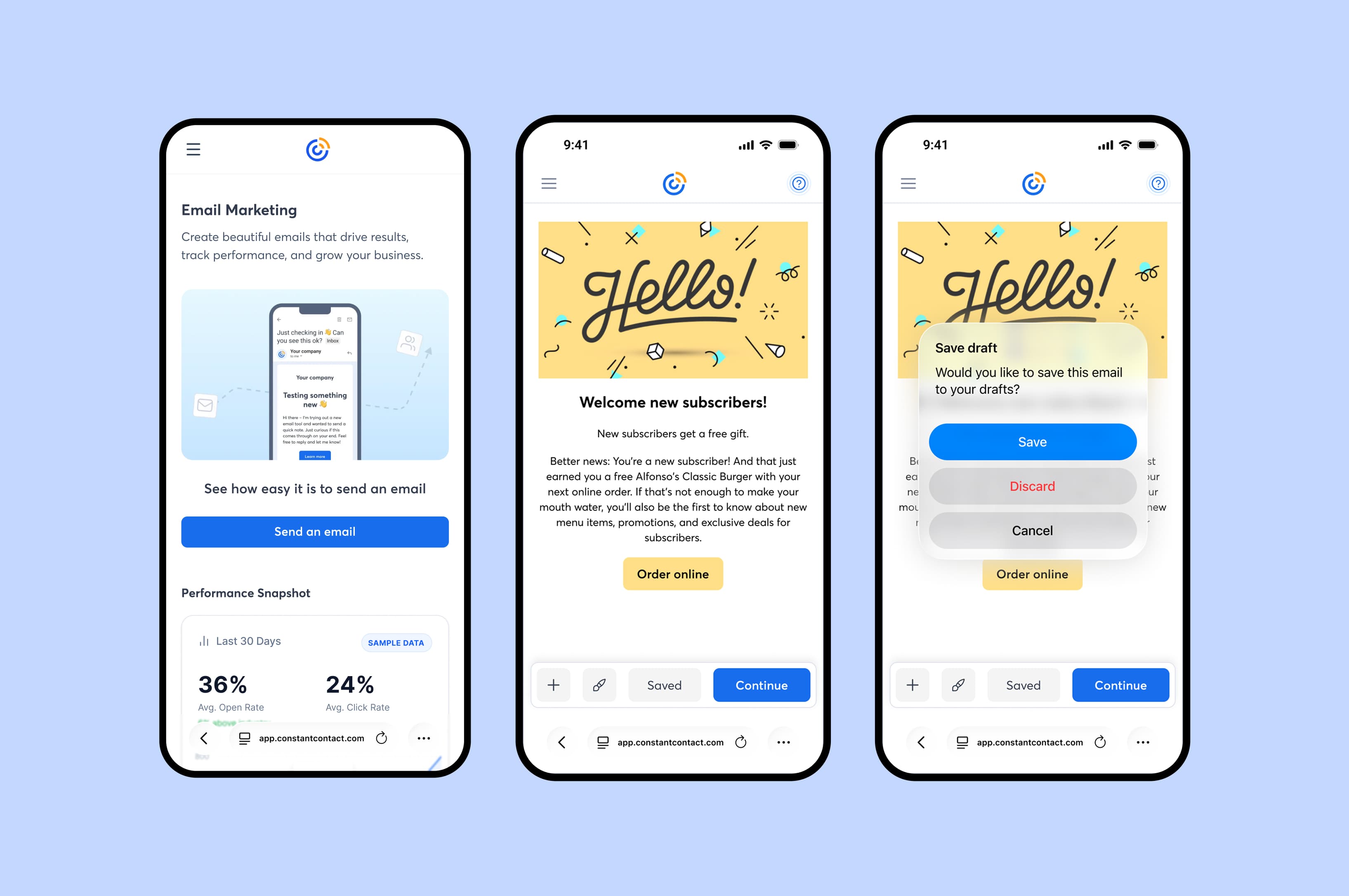
Express Send was a workaround that the team had shipped as a stopgap. Users opened a pre-built email, tweaked content, picked recipients, and hit send. The send numbers went up and the team considered it a win.
I challenged that conclusion. Those send numbers had no qualitative backing. Express Send was masking the capability gap, and users were forming a false impression of what the product could do.
Activated users converted to paid at significantly higher rates. The quality of the first real send was the highest-leverage opportunity on mobile. Users needed to trust that they could create an email themselves.
Research
Challenging an existing solution required evidence. I built the case with three layers: a qualitative gap in the existing data, user research I'd conducted 18 months earlier on the native app, and a competitive audit showing no one in the market had solved mobile email creation well. Together they justified the investment.
- Qualitative Gap Audit: Express Send had been approved on send volume alone. No qualitative signal existed on what users were actually experiencing. That absence was itself evidence.
- My Prior Native App Research: 18 months earlier I'd designed and tested a full mobile editing pattern for the native app. It was deprioritized, but 10 out of 10 participants wanted a capable mobile editor. That signal held.
- Competitive Analysis: I audited direct and indirect competitors' mobile email creation experiences. Nobody had solved dexterity on small screens well. The problem was unsolved across the industry.
- Defining the bar: An experience that gave users real confidence they could create and send. Good enough to change behavior and set accurate expectations.
Design Process
I'd originally designed this three-state model for the native app 18 months earlier. It was deprioritized for scope, but the research signal held. I adapted it for mobile web in two weeks, with strong engineering partnership on the implementation.
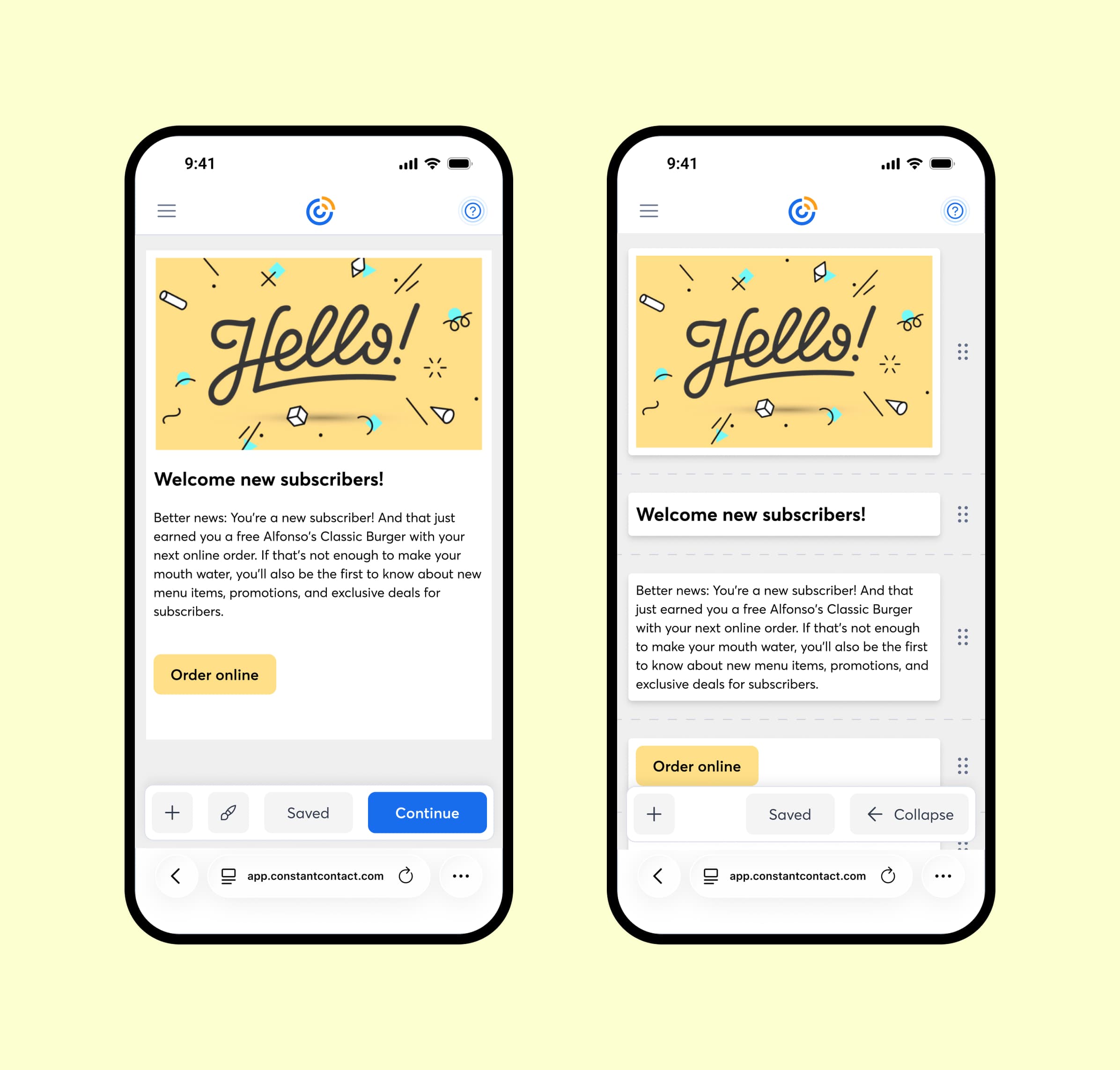
Email Preview
Clean starting state. Elements below the 40px touch minimum stay hidden until the user engages.
Expansion
Tap to expand. All blocks surface to tappable size. Hidden elements like spacers become visible. Structure reveals itself on demand.
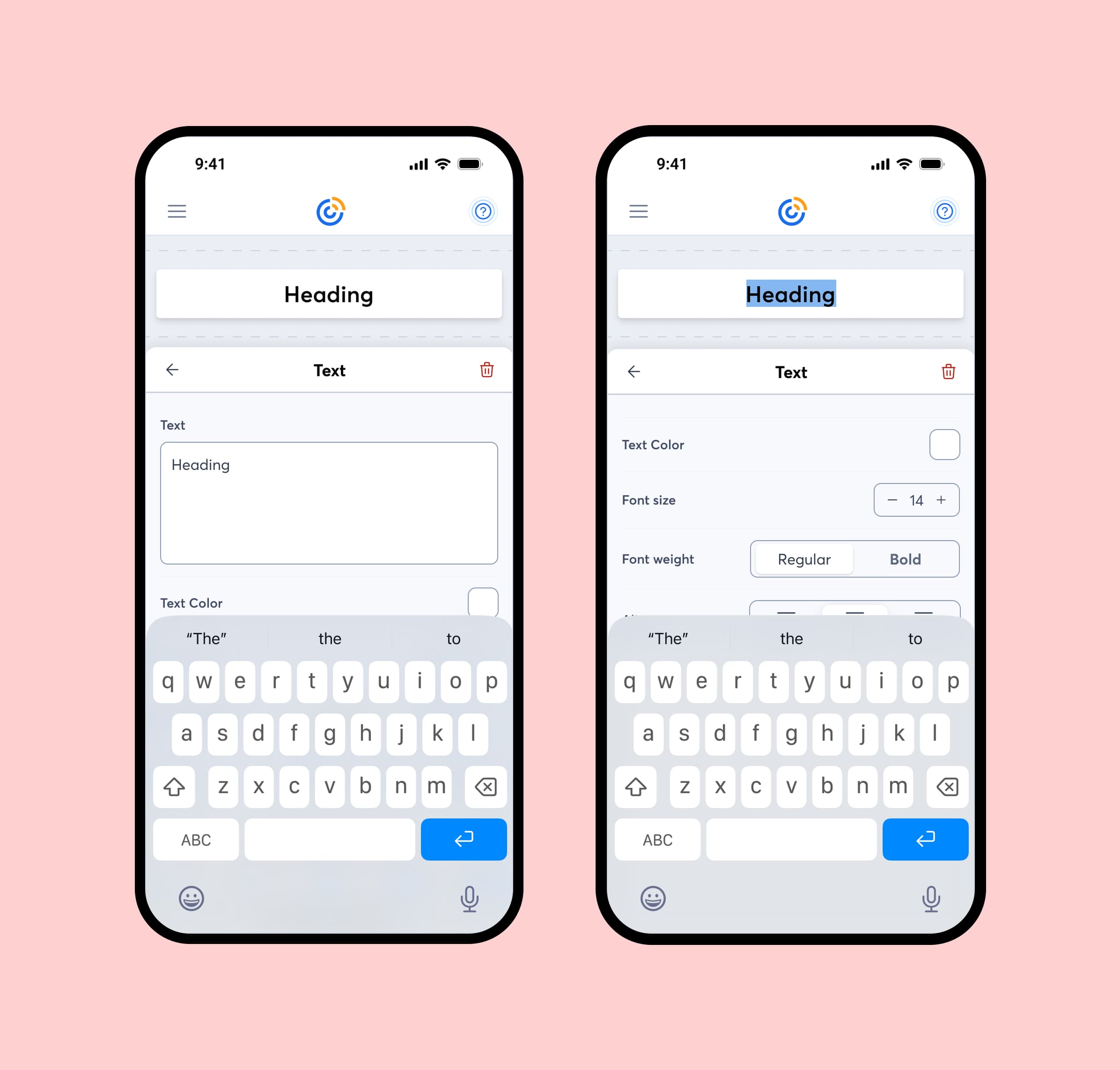
Block Editing
Tap any block to push into a dynamic editing panel. Controls adapt to the block type: text, image, button, divider. Back out to expansion, then preview.
Accessibility First
WCAG-compliant touch targets and contrast ratios at every state. Built in from the start.