
Back
Template Picker
Constant Contact • Web & Mobile
My Role
Product Design
User Experience
Interaction
My Team
Authoring team
Product manager
UXR - Kate B.
My Tools
Figma
Notion
Jira
User Testing
Description
This project involved a redesign of the existing Constant Contact template picker interface to improve usability, accessibility, and aesthetic appeal, making it easier for users to find and select templates. We also enhanced the efficiency and effectiveness of the email creation process, significantly reducing the time users spend in the flow.
The redesign led to a 5.6% increase in overall completion rates. Remarkably, the use of industry-specific templates surged by 274%, and there was an 84% reduction in users manually searching for templates, indicating a more intuitive user experience.
Context
Small business owners often want their marketing to look consistent, but few have time to configure logos, fonts, and color schemes from scratch. And when brand setup is tedious or confusing, they skip it entirely.BrandKit was designed to remove that barrier. By giving users the option to upload their assets or automatically extract branding from their website, we made it easier for them to stand out without needing design experience.But the experience had to do more than just look good. It needed to integrate deeply into the Constant Contact ecosystem, automatically applying branding across content types without overwhelming users with configuration. And it had to feel smart, flexible, and approachable to people who might never have used a branding tool before.
My Role
As the lead designer, I was responsible for the entire redesign process, including user research, prototype development, and user testing. My focus was on enhancing the functionality and visual layout of the template picker to meet the evolving needs of our users, while also focusing on improving user interaction with the template picker to make the email creation process more intuitive and user-friendly.
Challenge
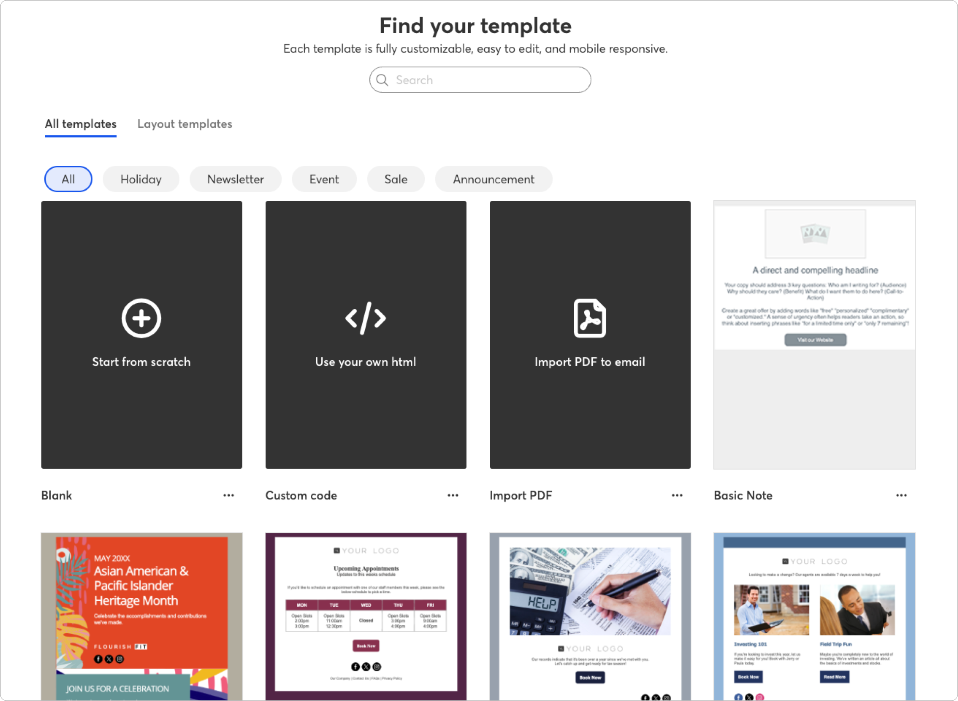
The original template picker was often noted by users as being cluttered and difficult to navigate, which hindered their ability to efficiently find suitable templates, which led to lower completion rates and higher frustration levels. The project aimed to simplify the selection process while ensuring a more intuitive user interface.
Process and Execution
Research: Our UXR team conducted in-depth user studies to understand how different segments interact with the template picker. This included usability tests to identify pain points in the existing design.
Design Iterations: Developed several iterations of the redesign, each refined through feedback collected from a series of A/B testing sessions. The focus was on creating a balanced interface that facilitated easier navigation and quicker template selection.
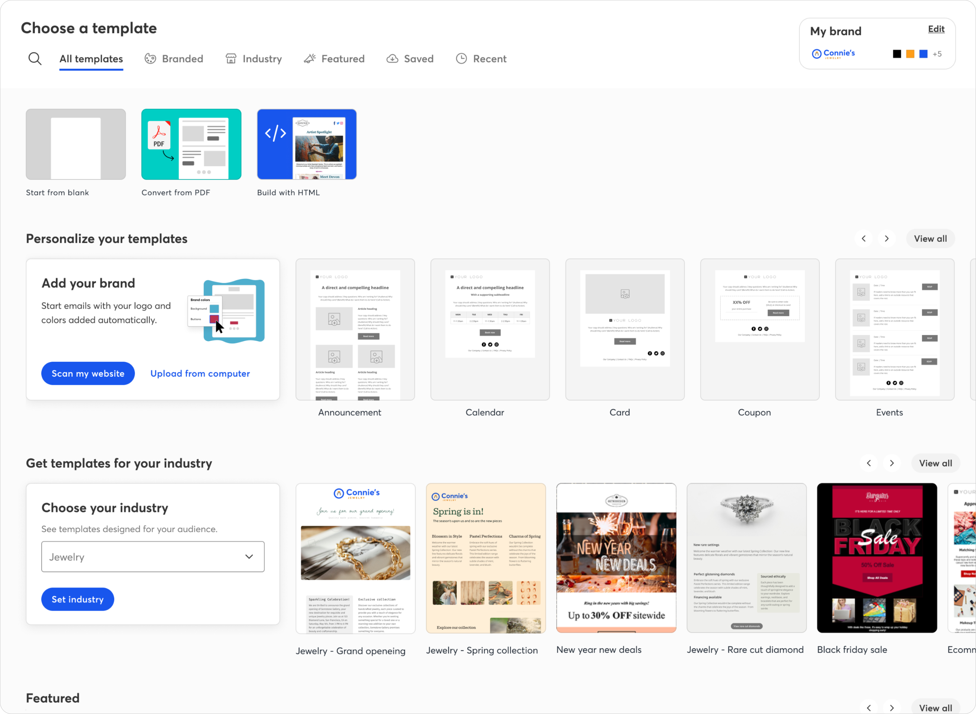
Final Design: The redesigned template picker now features an industry picker upfront, and a more focused selection of industry-specific templates, which directly aligns with user needs and preferences. We also implemented a streamlined interface with enhanced categorization and filters as well as visual previews and hover effects to allow users to quickly gauge a template’s look and feel without needing to open it.
Results and impact
Quantitative Data: The redesign led to a 5.6% increase in overall completion rates. Remarkably, the use of industry-specific templates surged by 274%, and there was an 84% reduction in users manually searching for templates, indicating a more intuitive user experience.
Qualitative Feedback: Feedback has been overwhelmingly positive, with users appreciating the reduced need to search manually and the ease of finding relevant templates.
Takeaway
This project underscored the importance of understanding user behavior and preferences in design, showing how targeted improvements can lead to substantial increases in user satisfaction and efficiency.
The redesign of the template picker has not only improved the efficiency of the email creation flow but also enhanced user satisfaction by aligning more closely with their needs, as evidenced by the significant increase in completion rates and the adoption of industry-specific templates.
Back
Template Picker
Constant Contact • Web & Mobile
My Role
Product Design
User Experience
Interaction
My Team
Authoring team
Product manager
UXR - Kate B.
My Tools
Figma
Notion
Jira
User Testing
Description
This project involved a redesign of the existing Constant Contact template picker interface to improve usability, accessibility, and aesthetic appeal, making it easier for users to find and select templates. We also enhanced the efficiency and effectiveness of the email creation process, significantly reducing the time users spend in the flow.
The redesign led to a 5.6% increase in overall completion rates. Remarkably, the use of industry-specific templates surged by 274%, and there was an 84% reduction in users manually searching for templates, indicating a more intuitive user experience.
Context
Small business owners often want their marketing to look consistent, but few have time to configure logos, fonts, and color schemes from scratch. And when brand setup is tedious or confusing, they skip it entirely.BrandKit was designed to remove that barrier. By giving users the option to upload their assets or automatically extract branding from their website, we made it easier for them to stand out without needing design experience.But the experience had to do more than just look good. It needed to integrate deeply into the Constant Contact ecosystem, automatically applying branding across content types without overwhelming users with configuration. And it had to feel smart, flexible, and approachable to people who might never have used a branding tool before.
My Role
As the lead designer, I was responsible for the entire redesign process, including user research, prototype development, and user testing. My focus was on enhancing the functionality and visual layout of the template picker to meet the evolving needs of our users, while also focusing on improving user interaction with the template picker to make the email creation process more intuitive and user-friendly.
Challenge
The original template picker was often noted by users as being cluttered and difficult to navigate, which hindered their ability to efficiently find suitable templates, which led to lower completion rates and higher frustration levels. The project aimed to simplify the selection process while ensuring a more intuitive user interface.
Process and Execution
Research: Our UXR team conducted in-depth user studies to understand how different segments interact with the template picker. This included usability tests to identify pain points in the existing design.
Design Iterations: Developed several iterations of the redesign, each refined through feedback collected from a series of A/B testing sessions. The focus was on creating a balanced interface that facilitated easier navigation and quicker template selection.
Final Design: The redesigned template picker now features an industry picker upfront, and a more focused selection of industry-specific templates, which directly aligns with user needs and preferences. We also implemented a streamlined interface with enhanced categorization and filters as well as visual previews and hover effects to allow users to quickly gauge a template’s look and feel without needing to open it.
Results and impact
Quantitative Data: The redesign led to a 5.6% increase in overall completion rates. Remarkably, the use of industry-specific templates surged by 274%, and there was an 84% reduction in users manually searching for templates, indicating a more intuitive user experience.
Qualitative Feedback: Feedback has been overwhelmingly positive, with users appreciating the reduced need to search manually and the ease of finding relevant templates.
Takeaway
This project underscored the importance of understanding user behavior and preferences in design, showing how targeted improvements can lead to substantial increases in user satisfaction and efficiency.
The redesign of the template picker has not only improved the efficiency of the email creation flow but also enhanced user satisfaction by aligning more closely with their needs, as evidenced by the significant increase in completion rates and the adoption of industry-specific templates.
I design for teams that care about doing it right
Get in touch, or send me a cat video

