Back
Social Management
Constant Contact • Mobile
My Role
Lead Product Designer
UX Strategy
Systems Thinking
My Team
Social Platform
Mobile and Web PMs
Mobile Engineering
UXR
My Tools
Figma
Notion
Jira
User Testing
The Problem: A Feature That Users Tried Once and Never Returned To
The social media posting feature in Constant Contact’s mobile app was functional, but it wasn’t working. Usage data showed that only a small fraction of active users were even discovering the feature, and of those who did, most never used it again.
On the web, social posting was well established, but on mobile, the flow was fragmented, unfamiliar, and clunky. We needed to unify the experience between platforms while making the mobile version intuitive enough to drive repeat use.
Analyzing the Landscape Before Redesigning It
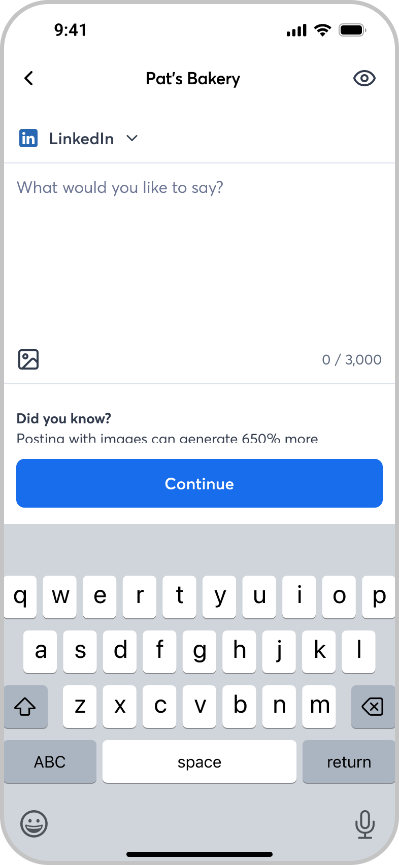
We started by benchmarking mobile posting patterns across major apps, including the native Facebook, Instagram, and LinkedIn experiences.
The goal was not to copy them, but to understand why those flows worked, and how we could borrow their best interaction models while maintaining consistency across our ecosystem.
Our solution combined the strongest aspects of each native flow into a single, predictable pattern that felt familiar to users while preserving Constant Contact’s design system and accessibility requirements.
The Multi-Account Problem: Simplicity vs. Effectiveness
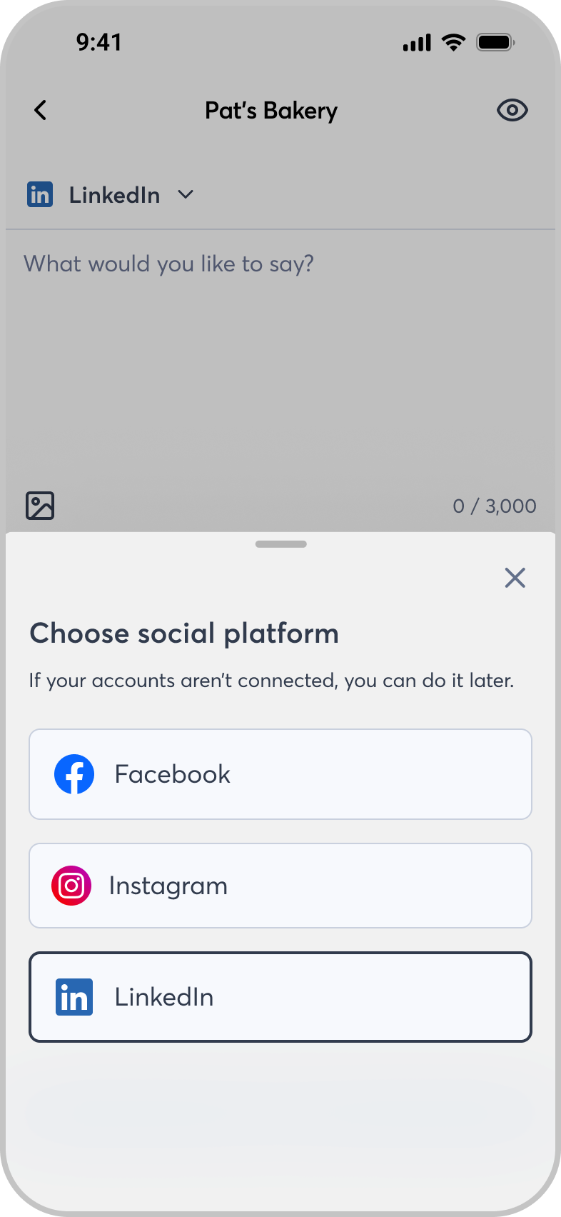
One key gap in our mobile experience was multi-account posting. Users could easily post to multiple platforms on desktop, but the mobile implementation was awkward and error-prone.
We also discovered that posting identical content to every platform, a behavior we had encouraged through design, actually hurt users’ reach and engagement. Each network optimizes for a different content format, so the same post duplicated across channels often performed poorly.
The design challenge became clear: we needed to make cross-posting efficient, but also smart.
Shifting the Focus From Distribution to Efficiency
Our UXR team ran qualitative sessions with small business owners to understand their actual habits and pain points.Almost universally, they told us the same thing: they wanted to post to multiple platforms in a unique style, but they didn’t have time to rewrite posts for each one.
The insight reframed our problem. The goal wasn’t to prevent multi-posting, it was to reduce the time it took to adapt a post for each platform.
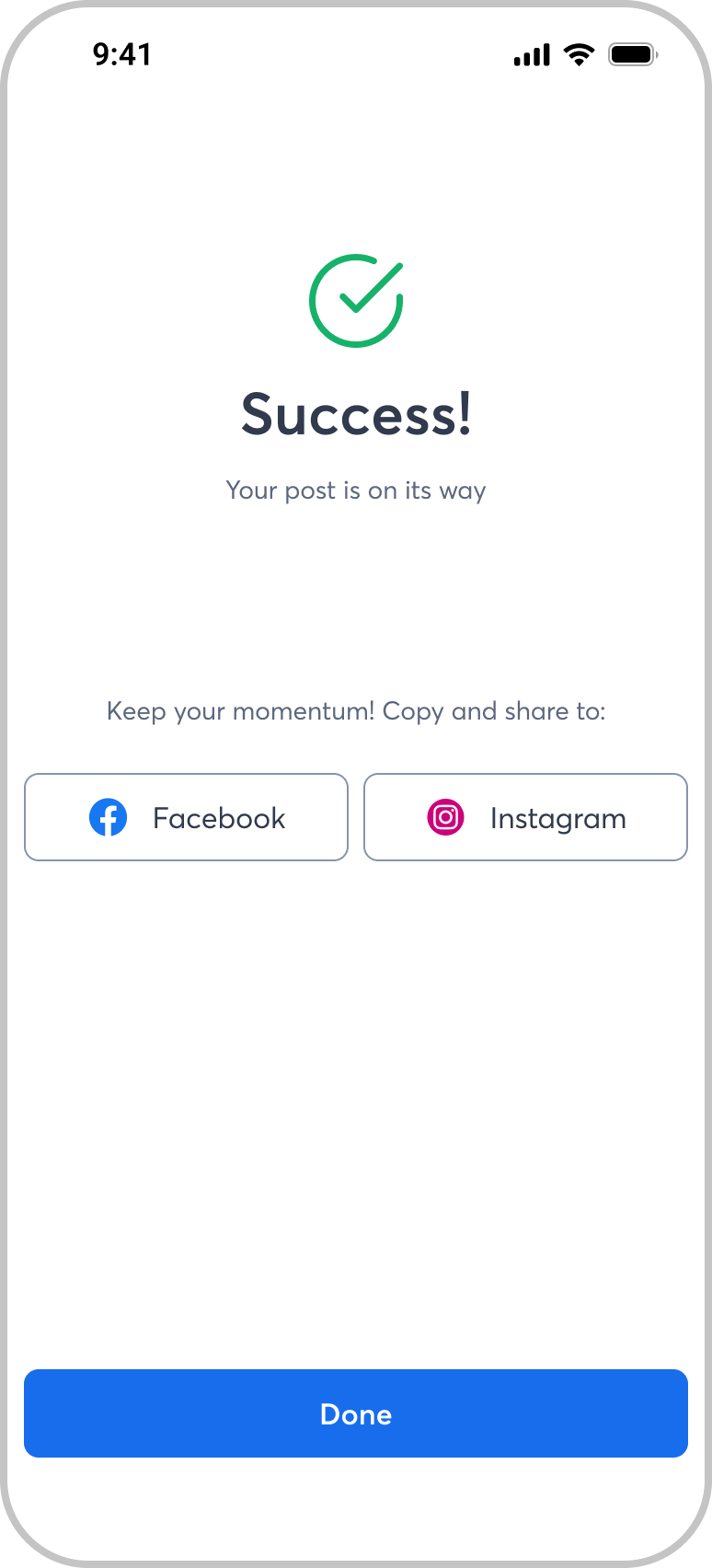
To solve this, I designed a “Copy to Another Platform” feature that activates after a post is successfully published or scheduled. When users copy a post, they can choose to use AI to automatically adapt it to the new platform’s format, optimizing tone, length, and structure. This gave users speed without sacrificing authenticity or reach.
Helping Users Know What to Post
- Even after streamlining the posting flow, one question kept coming up in usability testing: “I’m not sure what to post.”
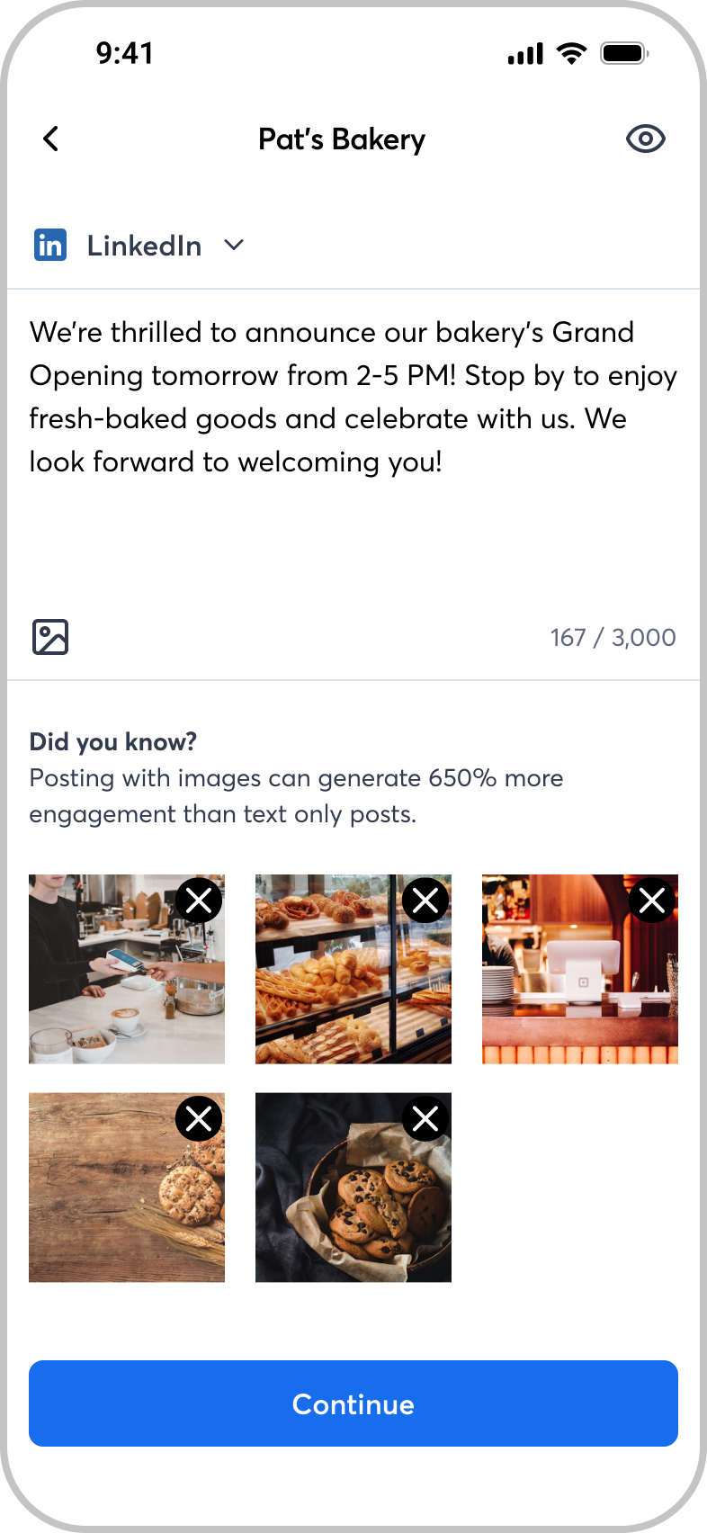
- To address this, I designed a contextual tip system that displays insights relevant to the selected platform.For example, Facebook users might see a prompt about post length and engagement, while LinkedIn users might see tips about tone or professional hashtags.
- This feature was intentionally lightweight, designed to educate without overwhelming.Future iterations will expand it with AI-generated content suggestions tailored to the user’s business category and trending topics, further reducing time-to-post while increasing value over native tools.
Expanding the Experience Through Iteration
After the initial redesign, we added support for video uploads, hashtag lookup, and improved media selection options. Each iteration was informed by ongoing usability sessions and telemetry data that highlighted where users slowed down or dropped off.
Feedback was clear: users found the experience simpler, more predictable, and ultimately faster than before.Some initially noted it took longer to post to multiple platforms when limited to one at a time, but discovery sessions showed that the new copy-and-adapt workflow felt faster overall and more intentional.
Validation and Rollout
Following multiple successful test rounds with UXR, we launched a partial rollout to 20% of our user base. Within two weeks, after no incidents and consistent positive feedback, the feature was rolled out to 100% of users.
Results were immediate and measurable:
- 81% increase in feature adoption within the first three months
- 144% increase in post completion rate compared to previous versions
- Positive qualitative feedback about ease of use, clarity, and confidence in cross-posting
The Takeaway
This redesign wasn’t about adding new features, it was about eliminating friction and matching how small business owners actually work.
By grounding the experience in real behavior, unifying mobile and web patterns, and using AI to reduce effort rather than add novelty, we transformed social posting from an underused utility into a core engagement feature.
The lesson was clear: when speed and clarity align with user motivation, adoption follows naturally.
Back
Social Management
Constant Contact • Mobile
My Role
Lead Product Designer
UX Strategy
Systems Thinking
My Team
Social Platform
Mobile and Web PMs
Mobile Engineering
UXR
My Tools
Figma
Notion
Jira
User Testing
The Problem: A Feature That Users Tried Once and Never Returned To
The social media posting feature in Constant Contact’s mobile app was functional, but it wasn’t working. Usage data showed that only a small fraction of active users were even discovering the feature, and of those who did, most never used it again.
On the web, social posting was well established, but on mobile, the flow was fragmented, unfamiliar, and clunky. We needed to unify the experience between platforms while making the mobile version intuitive enough to drive repeat use.
Analyzing the Landscape Before Redesigning It
We started by benchmarking mobile posting patterns across major apps, including the native Facebook, Instagram, and LinkedIn experiences.
The goal was not to copy them, but to understand why those flows worked, and how we could borrow their best interaction models while maintaining consistency across our ecosystem.
Our solution combined the strongest aspects of each native flow into a single, predictable pattern that felt familiar to users while preserving Constant Contact’s design system and accessibility requirements.
The Multi-Account Problem: Simplicity vs. Effectiveness
One key gap in our mobile experience was multi-account posting. Users could easily post to multiple platforms on desktop, but the mobile implementation was awkward and error-prone.
We also discovered that posting identical content to every platform, a behavior we had encouraged through design, actually hurt users’ reach and engagement. Each network optimizes for a different content format, so the same post duplicated across channels often performed poorly.
The design challenge became clear: we needed to make cross-posting efficient, but also smart.
Shifting the Focus From Distribution to Efficiency
Our UXR team ran qualitative sessions with small business owners to understand their actual habits and pain points.Almost universally, they told us the same thing: they wanted to post to multiple platforms in a unique style, but they didn’t have time to rewrite posts for each one.
The insight reframed our problem. The goal wasn’t to prevent multi-posting, it was to reduce the time it took to adapt a post for each platform.
To solve this, I designed a “Copy to Another Platform” feature that activates after a post is successfully published or scheduled. When users copy a post, they can choose to use AI to automatically adapt it to the new platform’s format, optimizing tone, length, and structure. This gave users speed without sacrificing authenticity or reach.
Helping Users Know What to Post
- Even after streamlining the posting flow, one question kept coming up in usability testing: “I’m not sure what to post.”
- To address this, I designed a contextual tip system that displays insights relevant to the selected platform.For example, Facebook users might see a prompt about post length and engagement, while LinkedIn users might see tips about tone or professional hashtags.
- This feature was intentionally lightweight, designed to educate without overwhelming.Future iterations will expand it with AI-generated content suggestions tailored to the user’s business category and trending topics, further reducing time-to-post while increasing value over native tools.
Expanding the Experience Through Iteration
After the initial redesign, we added support for video uploads, hashtag lookup, and improved media selection options. Each iteration was informed by ongoing usability sessions and telemetry data that highlighted where users slowed down or dropped off.
Feedback was clear: users found the experience simpler, more predictable, and ultimately faster than before.Some initially noted it took longer to post to multiple platforms when limited to one at a time, but discovery sessions showed that the new copy-and-adapt workflow felt faster overall and more intentional.
Validation and Rollout
Following multiple successful test rounds with UXR, we launched a partial rollout to 20% of our user base. Within two weeks, after no incidents and consistent positive feedback, the feature was rolled out to 100% of users.
Results were immediate and measurable:
- 81% increase in feature adoption within the first three months
- 144% increase in post completion rate compared to previous versions
- Positive qualitative feedback about ease of use, clarity, and confidence in cross-posting


The Takeaway
This redesign wasn’t about adding new features, it was about eliminating friction and matching how small business owners actually work.
By grounding the experience in real behavior, unifying mobile and web patterns, and using AI to reduce effort rather than add novelty, we transformed social posting from an underused utility into a core engagement feature.
The lesson was clear: when speed and clarity align with user motivation, adoption follows naturally.
I design for teams that care about doing it right
Get in touch, or send me a cat video