
Back
Intent-based Onboarding
Constant Contact • Mobile
My Role
Lead Product Designer · UX Strategy · Experimentation
UX Strategy
Experimentation
My Team
Onboarding
Product Analytics
UXR
Engineering
My Tools
Figma
Notion
Jira
Confluence
The Problem: Two Competing Philosophies and a Friction-Filled Start
Onboarding at Constant Contact had long been a point of internal debate. Half the organization believed users should enter the product with minimal friction to reach activation quickly. The other half believed key data should be collected up front to prevent later roadblocks like email verification or missing business addresses.
Both perspectives had merit, but both created their own forms of drop-off. Users often hit mandatory steps that stalled progress, or entered the product unprepared and confused about what to do next. Many new trial users also lacked confidence navigating the platform, signaling a need for more contextual guidance from the start.
The Goal: Capture Intent Early to Personalize the Experience
Intent-Based Onboarding (IBO) focused on one key opportunity: help users tell us who they are and what they need, in as few steps as possible, so the product could adapt around them.
By capturing intent and goals during onboarding, we could tailor the home screen to show next-best actions instead of a generic feature overview. The objective was not to explain everything, but to guide each user toward meaningful progress immediately after signup.
Research and Design Exploration
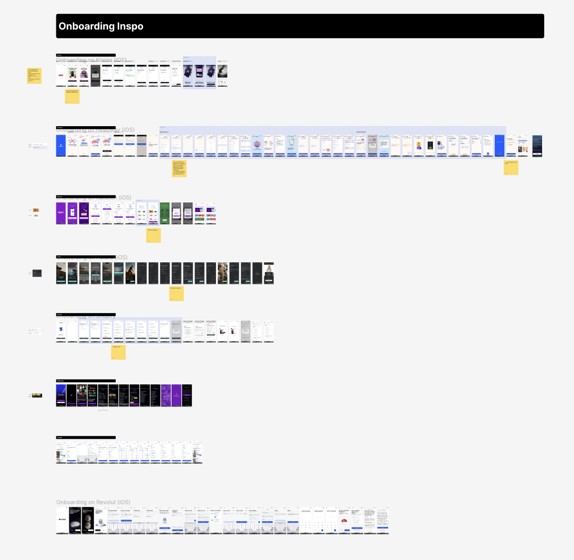
The first step was understanding how people interact with multi-select onboarding patterns. I analyzed flows from other high-performing apps to identify where usability breaks down and which interaction patterns encourage faster decision-making.
We tested two UI variations: vertically stacked full-width buttons and inline pill-shaped options. The pill format outperformed across every measure. It created more spatial breathing room, reduced visual fatigue, and improved recall. Participants remembered 80% of questions and responses compared to 40% for the stacked layout.
Positive results allowed us to streamline the experience further, reducing five pages of choices to four without losing clarity or data quality.
Streamlining The Experience
Positive results allowed us to streamline the experience further, reducing five pages of choices to four without losing clarity or data quality.
Addressing Platform and Feature Alignment
One challenge was that some features surfaced during onboarding were desktop-only. Showing these to mobile users created confusion and mismatched expectations.
We partnered with the mobile and customer success teams to adjust the API powering feature selection. This allowed us to dynamically label or group features based on platform availability. The result was a more accurate and trustworthy onboarding experience, aligned with each user’s device context.
Delivering a Smarter Home Screen
After onboarding, users landed on a home screen tailored to their goals, business type, and selected features. Full personalization was out of scope for the initial release, so we focused on high-impact elements first. By surfacing contextual cards that prompted users to verify emails, set up their website, or complete key activation steps, we proved that even lightweight guidance could improve orientation and momentum.
This measured approach allowed the team to validate the personalization model early and build a clear case for expanding it in future iterations.
Results and Measured Impact
- 17% faster path to first send for users who completed the intent-based flow
- 9% increase in early activation within the first week
- Reduced onboarding abandonment across new user cohorts
- Improved trial-to-paid conversion among “email-first” intent groups
While the impact on overall conversion was moderate, IBO proved effective at increasing activation and feature adoption within the first 30 days. These improvements directly influenced downstream metrics tied to paid user growth and retention.
The Takeaway
Intent-Based Onboarding demonstrated that meaningful personalization starts with better understanding, not more explanation. By gathering focused input early and translating it into guided next steps, we improved activation rates and reduced confusion across the first-time user experience.
The project set the foundation for a smarter, data-informed onboarding framework that continues to evolve across Constant Contact’s web and mobile ecosystems.
Back
Intent-based Onboarding
Constant Contact • Mobile
My Role
Lead Product Designer
UX Strategy
Experimentation
My Team
Onboarding
Product Analytics
UXR
Engineering
My Tools
Figma
Notion
Jira
Confluence
The Problem: Two Competing Philosophies and a Friction-Filled Start
Onboarding at Constant Contact had long been a point of internal debate. Half the organization believed users should enter the product with minimal friction to reach activation quickly. The other half believed key data should be collected up front to prevent later roadblocks like email verification or missing business addresses.
Both perspectives had merit, but both created their own forms of drop-off. Users often hit mandatory steps that stalled progress, or entered the product unprepared and confused about what to do next. Many new trial users also lacked confidence navigating the platform, signaling a need for more contextual guidance from the start.
The Goal: Capture Intent Early to Personalize the Experience
Intent-Based Onboarding (IBO) focused on one key opportunity: help users tell us who they are and what they need, in as few steps as possible, so the product could adapt around them.
By capturing intent and goals during onboarding, we could tailor the home screen to show next-best actions instead of a generic feature overview. The objective was not to explain everything, but to guide each user toward meaningful progress immediately after signup.
Research and Design Exploration
The first step was understanding how people interact with multi-select onboarding patterns. I analyzed flows from other high-performing apps to identify where usability breaks down and which interaction patterns encourage faster decision-making.
We tested two UI variations: vertically stacked full-width buttons and inline pill-shaped options. The pill format outperformed across every measure. It created more spatial breathing room, reduced visual fatigue, and improved recall. Participants remembered 80% of questions and responses compared to 40% for the stacked layout.
Positive results allowed us to streamline the experience further, reducing five pages of choices to four without losing clarity or data quality.
Streamlining The Experience
Positive results allowed us to streamline the experience further, reducing five pages of choices to four without losing clarity or data quality.
Addressing Platform and Feature Alignment
One challenge was that some features surfaced during onboarding were desktop-only. Showing these to mobile users created confusion and mismatched expectations.
We partnered with the mobile and customer success teams to adjust the API powering feature selection. This allowed us to dynamically label or group features based on platform availability. The result was a more accurate and trustworthy onboarding experience, aligned with each user’s device context.
Delivering a Smarter Home Screen
After onboarding, users landed on a home screen tailored to their goals, business type, and selected features. Full personalization was out of scope for the initial release, so we focused on high-impact elements first. By surfacing contextual cards that prompted users to verify emails, set up their website, or complete key activation steps, we proved that even lightweight guidance could improve orientation and momentum.
This measured approach allowed the team to validate the personalization model early and build a clear case for expanding it in future iterations.
Results and Measured Impact
- 17% faster path to first send for users who completed the intent-based flow
- 9% increase in early activation within the first week
- Reduced onboarding abandonment across new user cohorts
- Improved trial-to-paid conversion among “email-first” intent groups
While the impact on overall conversion was moderate, IBO proved effective at increasing activation and feature adoption within the first 30 days. These improvements directly influenced downstream metrics tied to paid user growth and retention.
The Takeaway
Intent-Based Onboarding demonstrated that meaningful personalization starts with better understanding, not more explanation. By gathering focused input early and translating it into guided next steps, we improved activation rates and reduced confusion across the first-time user experience.
The project set the foundation for a smarter, data-informed onboarding framework that continues to evolve across Constant Contact’s web and mobile ecosystems.
I design for teams that care about doing it right
Get in touch, or send me a cat video

