
Back
Brand Onboarding
Constant Contact • Web & Mobile
My Role
Product Design
User Experience
Interaction
My Team
Authoring team
Product manager
UXR - Kate B.
My Tools
Figma
Notion
Jira
User Testing
What we set out to solve
A guided onboarding flow that helps users apply consistent branding to their marketing content by uploading a logo, selecting brand colors, or scanning their existing website. The BrandKit experience was designed to give small business users a fast, intuitive way to make their campaigns feel polished and professional from the start.
Why branding mattered
Brand consistency is one of the easiest ways to make content stand out, but for many small business owners, the setup process feels like extra work. Before BrandKit, many users skipped brand setup altogether. They used generic templates, left placeholder logos in place, or sent emails with inconsistent colors and styles.
We saw an opportunity to turn branding into a lightweight, rewarding step in onboarding — not something that felt like a task. Our goal was to help users feel proud of what they were creating, without requiring them to have design knowledge or spend time configuring settings.
Designing for confidence, not complexity
When we looked at campaign data, one thing was clear: users who branded their emails performed better. They had stronger open rates, better clickthrough, and more confidence in their messaging. But most users were not doing it. Branding felt optional, difficult, or just unfamiliar.
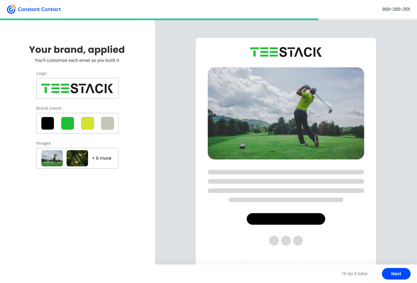
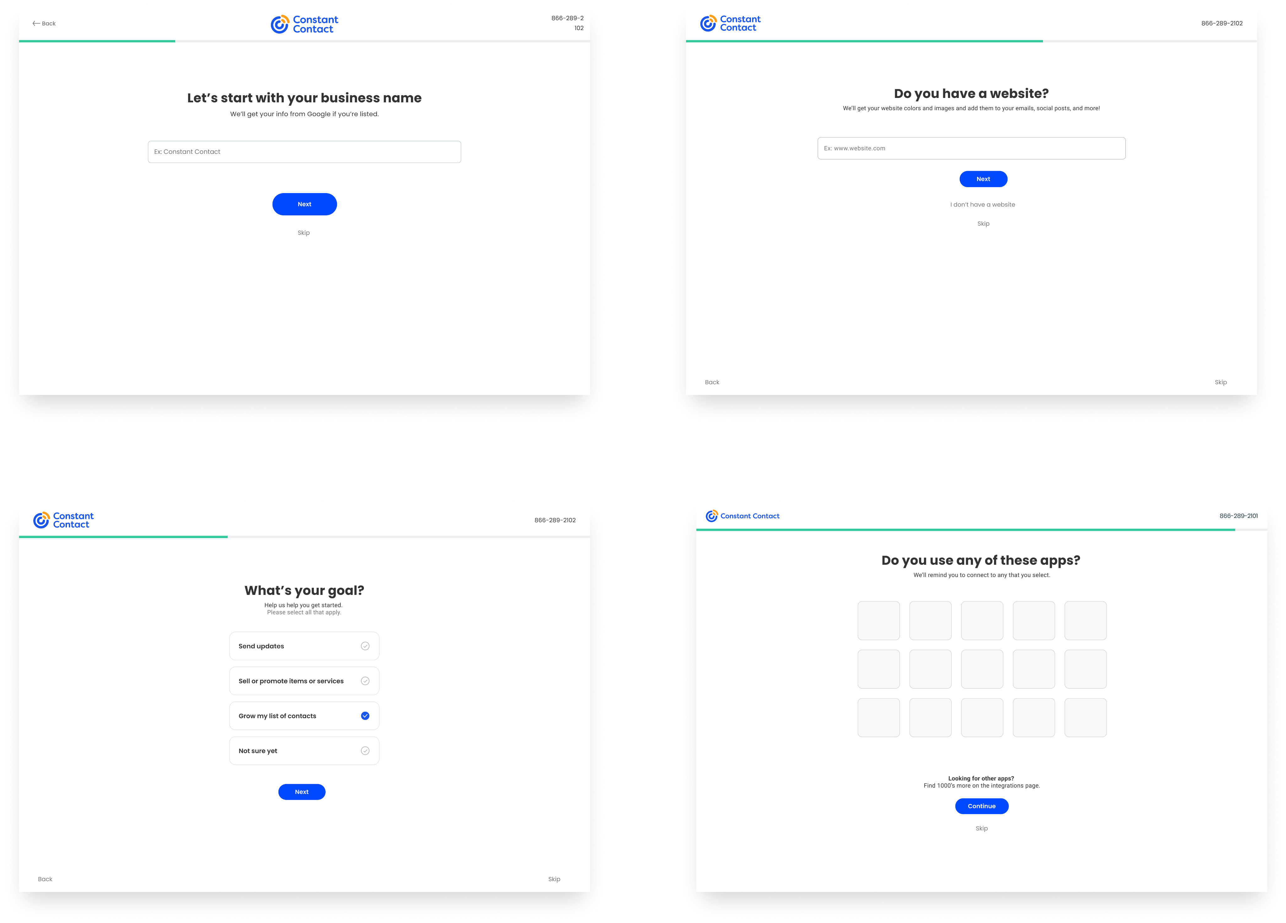
I led design for the onboarding flow that introduced BrandKit. The first version focused on simplicity — upload a logo, choose your brand colors, and see how your content might look. But even that needed refinement. Users did not always have a logo file ready, and many did not know what brand colors to choose.
So we added website scanning. If a user entered a URL, we automatically pulled available brand assets, including logos, icons, and prominent color values. For many, this felt like magic — a task they were ready to skip suddenly became a step they were excited about.
We also knew not everyone had a website. So I designed fallback flows that offered defaults and suggestions, allowing users to still move forward with a branded experience even without uploading anything.
Throughout the project, I worked closely with product and engineering to make sure this system could scale. BrandKit was integrated across landing pages, email templates, and other tools, so users would see their brand applied consistently without needing to take extra steps.
What we had to work around
• The experience needed to work for users with or without a logo or website
• Asset scanning had to be fast, accurate, and resilient to incomplete or poorly structured websites
• The onboarding flow had to feel seamless, not like a separate setup process
• BrandKit needed to plug into the existing campaign ecosystem and automatically apply styling across multiple surfaces

What changed after launch
• Trial users who interacted with BrandKit were 21 percent more likely to convert to paid accounts
• Campaigns with applied branding saw higher engagement and adoption of branded templates
• Users frequently described the setup as easy, helpful, and unexpectedly impressive
• Internal support saw a reduction in tickets related to brand setup or template customization
What this project taught me
Branding is often the difference between content that feels generic and content that feels like it belongs to a real business. This project turned that insight into action — making it effortless for users to express their identity without needing to think like a designer.
The best tools do not just make things easier. They make users feel more confident. That is what BrandKit delivered.
Back
Brand Onboarding
Constant Contact • Web & Mobile
My Role
Product Design
User Experience
Interaction
My Team
Authoring team
Product manager
UXR - Kate B.
My Tools
Figma
Notion
Jira
User Testing
What we set out to solve
A guided onboarding flow that helps users apply consistent branding to their marketing content by uploading a logo, selecting brand colors, or scanning their existing website. The BrandKit experience was designed to give small business users a fast, intuitive way to make their campaigns feel polished and professional from the start.
Why branding mattered
Brand consistency is one of the easiest ways to make content stand out, but for many small business owners, the setup process feels like extra work. Before BrandKit, many users skipped brand setup altogether. They used generic templates, left placeholder logos in place, or sent emails with inconsistent colors and styles.
We saw an opportunity to turn branding into a lightweight, rewarding step in onboarding — not something that felt like a task. Our goal was to help users feel proud of what they were creating, without requiring them to have design knowledge or spend time configuring settings.
Designing for confidence, not complexity
When we looked at campaign data, one thing was clear: users who branded their emails performed better. They had stronger open rates, better clickthrough, and more confidence in their messaging. But most users were not doing it. Branding felt optional, difficult, or just unfamiliar.
I led design for the onboarding flow that introduced BrandKit. The first version focused on simplicity — upload a logo, choose your brand colors, and see how your content might look. But even that needed refinement. Users did not always have a logo file ready, and many did not know what brand colors to choose.
So we added website scanning. If a user entered a URL, we automatically pulled available brand assets, including logos, icons, and prominent color values. For many, this felt like magic — a task they were ready to skip suddenly became a step they were excited about.
We also knew not everyone had a website. So I designed fallback flows that offered defaults and suggestions, allowing users to still move forward with a branded experience even without uploading anything.
Throughout the project, I worked closely with product and engineering to make sure this system could scale. BrandKit was integrated across landing pages, email templates, and other tools, so users would see their brand applied consistently without needing to take extra steps.
What we had to work around
• The experience needed to work for users with or without a logo or website
• Asset scanning had to be fast, accurate, and resilient to incomplete or poorly structured websites
• The onboarding flow had to feel seamless, not like a separate setup process
• BrandKit needed to plug into the existing campaign ecosystem and automatically apply styling across multiple surfaces
What changed after launch
• Trial users who interacted with BrandKit were 21 percent more likely to convert to paid accounts
• Campaigns with applied branding saw higher engagement and adoption of branded templates
• Users frequently described the setup as easy, helpful, and unexpectedly impressive
• Internal support saw a reduction in tickets related to brand setup or template customization
What this project taught me
Branding is often the difference between content that feels generic and content that feels like it belongs to a real business. This project turned that insight into action — making it effortless for users to express their identity without needing to think like a designer.
The best tools do not just make things easier. They make users feel more confident. That is what BrandKit delivered.
I design for teams that care about doing it right
Get in touch, or send me a cat video

